Stylish white decor schemes aren’t as simple or easy to get right as some may think. Sure, a blank palette takes away the margin for error in terms of clashing colour but go too plain and you’re in danger of living inside of a bland box. There are actually quite a few white shades out there! Paint pots come labelled with curiosities like: Navajo White, Seed Pearl, Silver Lining and Whisper. Aside from the shades of white there are to explore (they can be pretty open to interpretation on a backlit screen), let’s delve into adding interest through furniture, accessories, bold accents and differing aesthetics.
Visualizer: Z Design
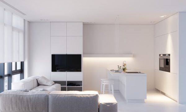
Don’t have an icy heart. A white living room seems the obvious place to start, and a kitchen diner to boot. As this is the heart of the home, go for a warmer shade of white so that this cosy zone doesn’t feel too cold, or use lighting to cast a warm glow.
Architect: Amir Navon Designer: Yael Perry & Dafna Gravinsky
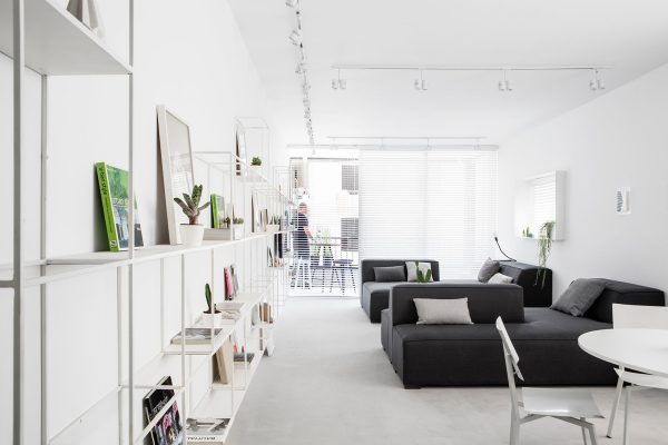
Use treasured items to colour your blank canvas. White wall shelves blend cleanly with white walls and allow display items to stand out.
Visualizer: KUOO Architects
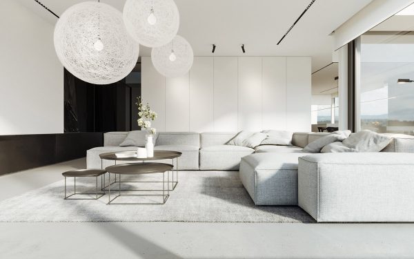
Initiate a shape theme. A set of round modern coffee tables and a group of high impact orb shaped modern chandeliers make a stunning central focal point.
Visualizer: Jamie Bush & Co
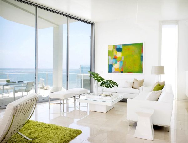
A gallery white wall is just crying out for some art. If you like this look check out these other living rooms with large wall art.
Designer: DNA Concept Design Photographer: Hey!Cheese Photography
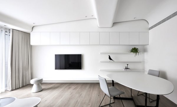
Who needs colour when there’s shape? Another shapely theme, only this time from the ceiling architecture and an unusually shaped table. The rest of the room is minimalist. See other minimalist homes that indulge in lots of white here.
Designer: Brain Factory
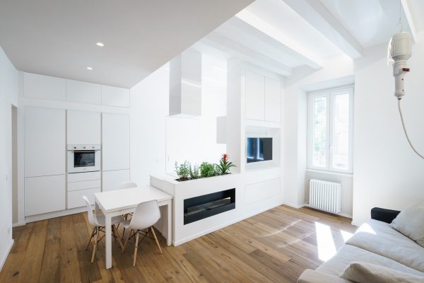
Warm up white walls with wood flooring.
Visualizer: Paulina Arcklin
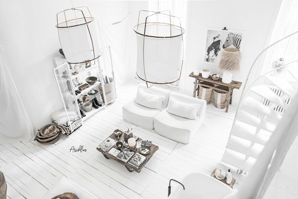
Go tribal with natural accessories. There are more pictures of this unique home here.
Visualizer: Image Box Studio
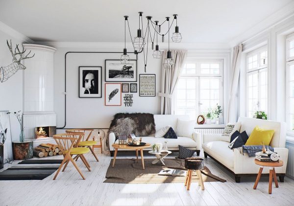
No one does white decor better than the Scandinavians. A Scandinavian living room is typically littered with monochrome elements, lots of wood frame furniture and an occasional pop of cheerful colour.
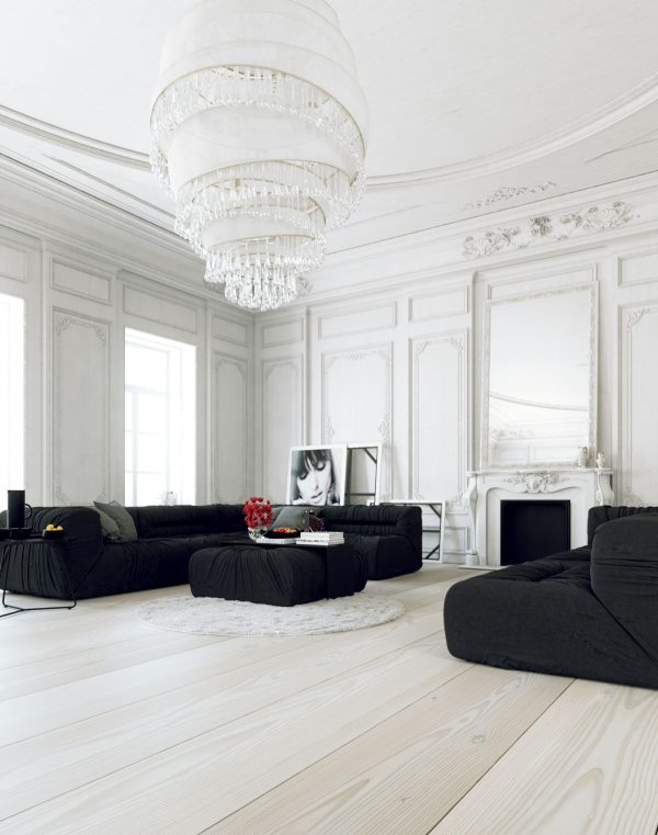
Visualizer: Juraj Talcik
White painted boiserie is like icing on a cake.
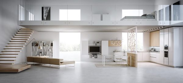
Visualizer: U6 Studio
Go all-in. This all-white interior design spans the entire house, making the mezzanine level in-keeping with the ground floor.
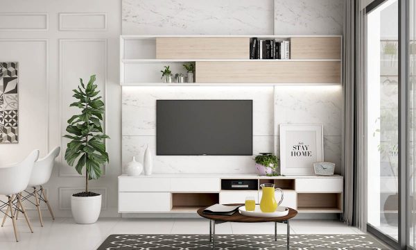
Visualizer: Hung Le
Use texture, pattern and framing. This tv wall decor has a grey veined white marble backdrop. Wainscoting decorates the adjacent wall. Even though both walls are white, these small additions add lots of interest.
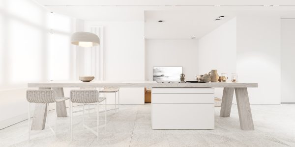
Visualizer: Igor Sirotov
This white dining room uses textured tile for the floor.
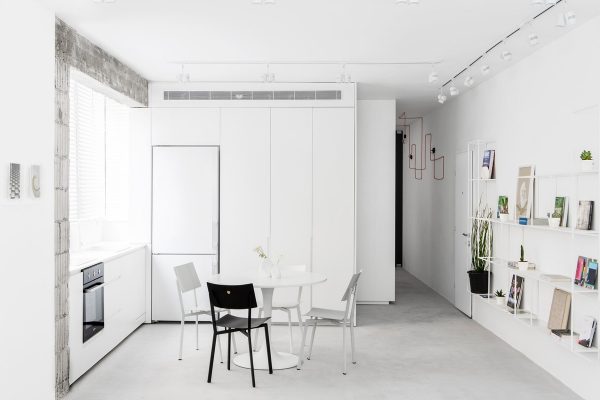
Architect: Amir Navon Designer: Yael Perry & Dafna Gravinsky
Change out just one or two white items. One white dining chair has been bumped for a black version in this black and white dining room. A black plant pot balances out the new recruit.
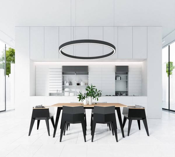
Visualizer: Artem Bobrov
These shapely black modern dining chairs look like origami.
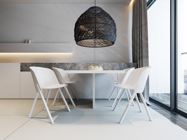
Visualizer: KUOO Architects
Crown a plain white dining set with a striking black dining pendant light.
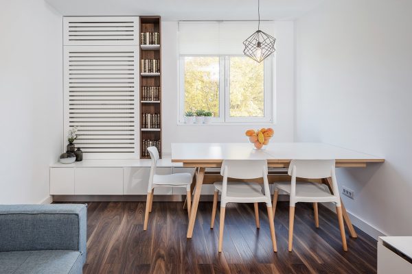
Visualizer: Craftr Studio
Dark wood looks strong cutting through a snow white scene.
Designer: Yael Perry
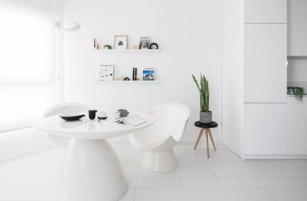
Season with black pepper. Not literally. But a white scheme is made more tasty with a peppering of small black accessories, like this crockery set and plant stand. Indoor plants add a sneaky snippet of green too.
Visualizer: Paulina Arcklin
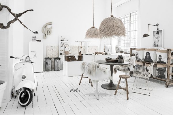
Add soft textures, like the bushy light shades and shaggy faux fur throws of this tribal decor.
Visualizer: Z Design
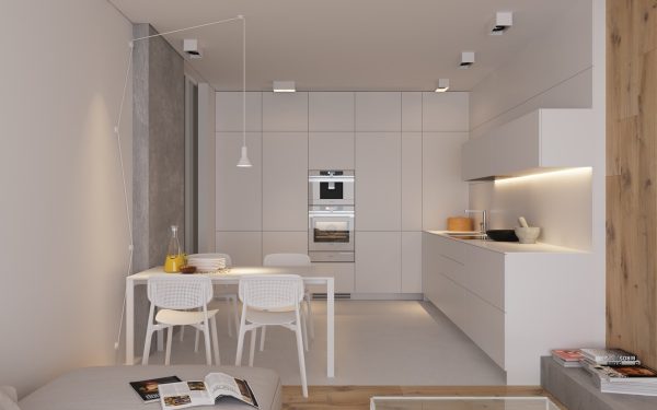
Build in some industrial flair with a concrete accent wall.
Designer: Yael Perry
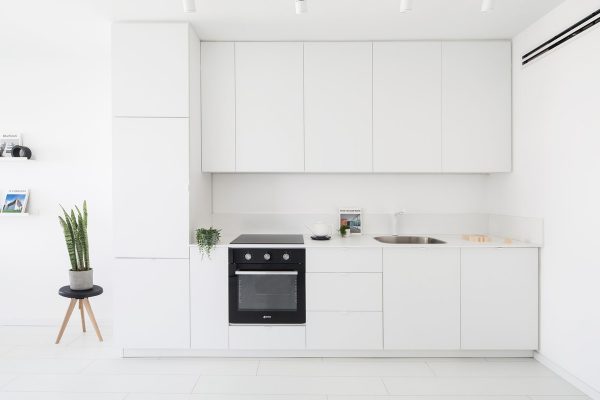
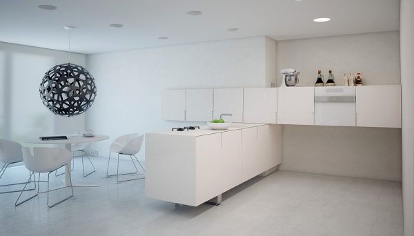
Break a run of white kitchen units with an integrated black oven.
Visualizer: Modom Studio
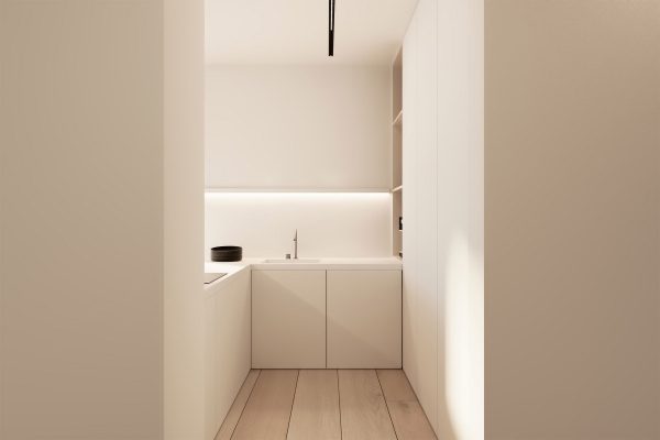
Make a quirky layout of ordinary white kitchen units.
Visualizer: KUOO Architects
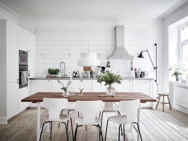
White decor helps a small kitchen feel more spacious.
Source: Stadshem
Scandinavian kitchens have most of the cooking utensils out on display to create a culinary buzz.
Designer: Euge & Seta
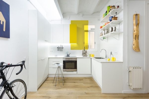
Throw in a block of colour like this yellow accent kitchen.
Visualizer: Inuti
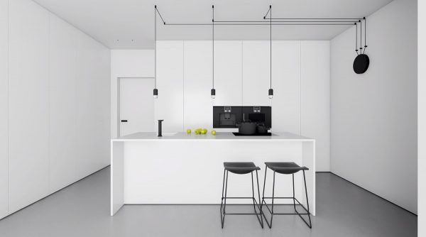
Draw out a design with electrical wiring. The route of these kitchen pendant lights looks like a subway map. Black kitchen bar stools match the ceiling feature.
Visualizer: KUOO Architects
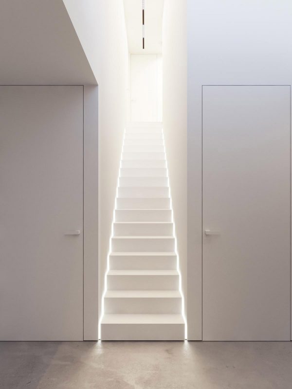
A stairway to heaven? Nope, just some heavenly white LED lighting.
Visualizer: Marina Tsishyna
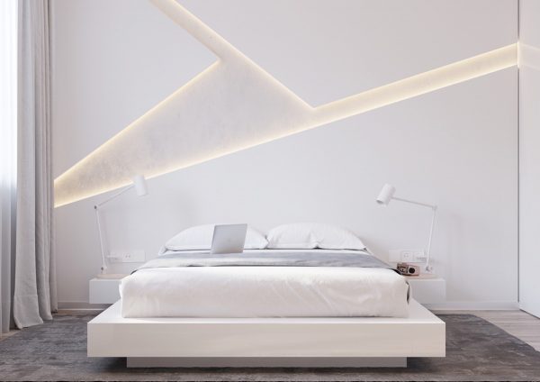
Jazz up a white bedroom with an eye-catching feature wall.
Visualizer: N-Gon Archviz
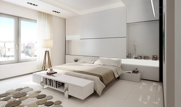
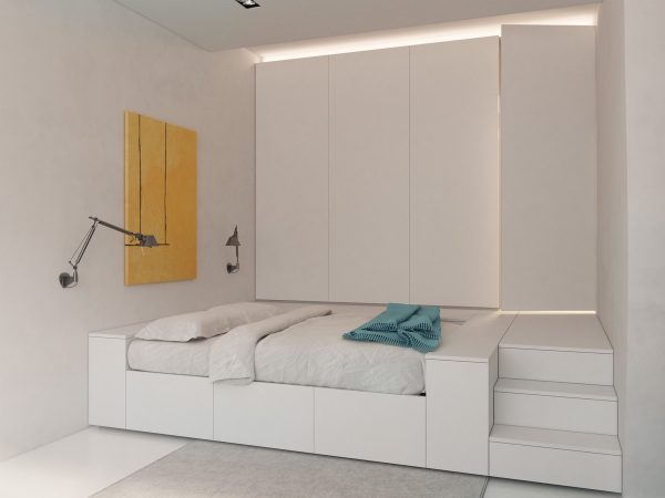
Use warmer neutrals to soften. The wooden legs of this floor lamp are complemented by a neutral pebble rug and bed throw.
Visualizer: Vlad Mishin
Embrace flexibility. The beauty of a predominantly white scheme is that you can change out colour with ease. These swing arm wall lamps light bright wall art that can be swapped in an instant.
Visualizer: BrainFactory
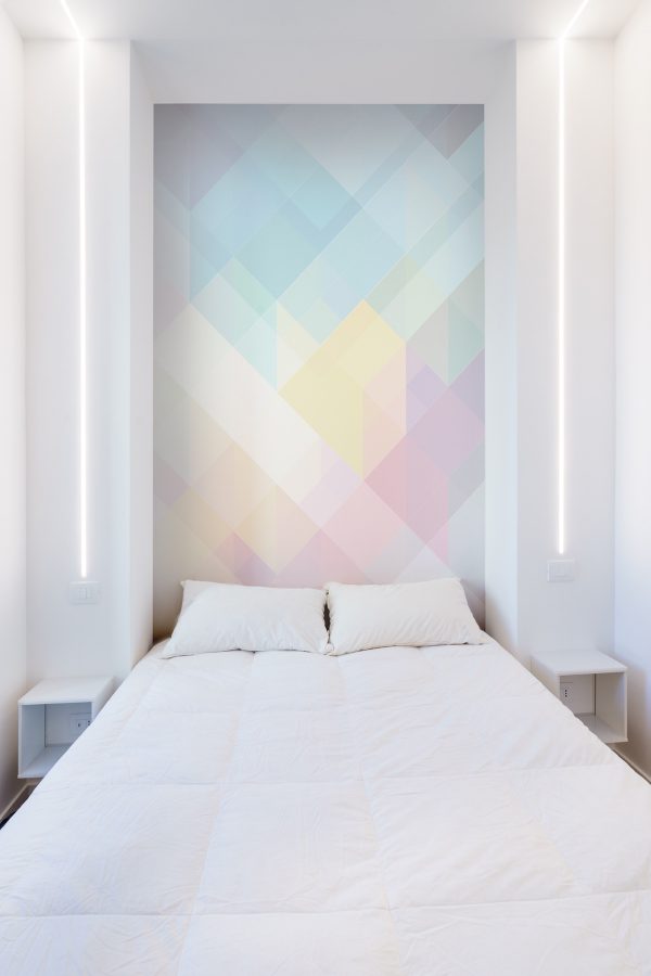
This pastel headboard feature wall is a little more permanent, but oh so beautiful. Also note the fantastic recessed bedside lighting strips that travel up and over the ceiling.
Visualizer: Duan
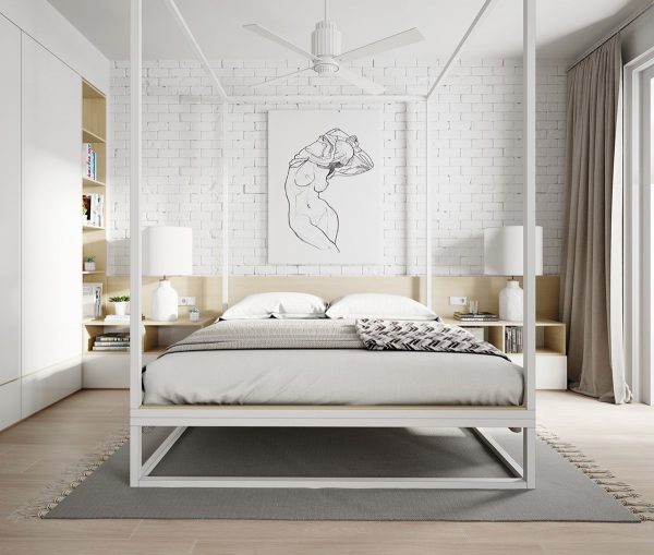
Whitewash exposed brickwork for a cool loft look. A modern four poster bed looks great against the urban chic backdrop, with a unique ceiling fan and artwork contained within its frame.
Visualizer: Pavel Pisanko
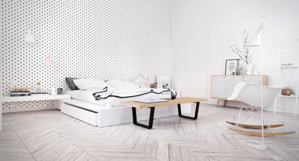
Turn up the volume on pattern. A white decor scheme doesn’t have to be plain. Black polka dots and geometrics update the look.
Source: Ivy Muse
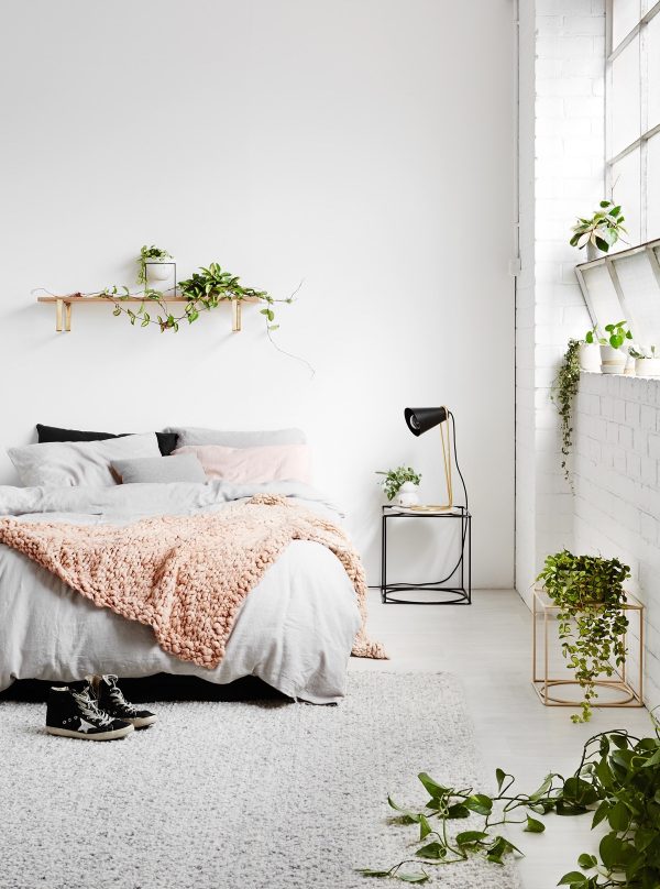
Turn your white house into a greenhouse.
Visualizer: Filip Sapojnicov
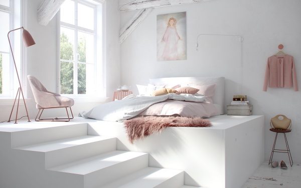
Pretty pastel pink accents look divine on white.
Visualizer: AM Studio
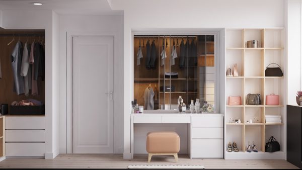
The white interior door next to this makeup vanity is kitted out with white door furniture for a clean finish.
Visualizer: Odair Santos
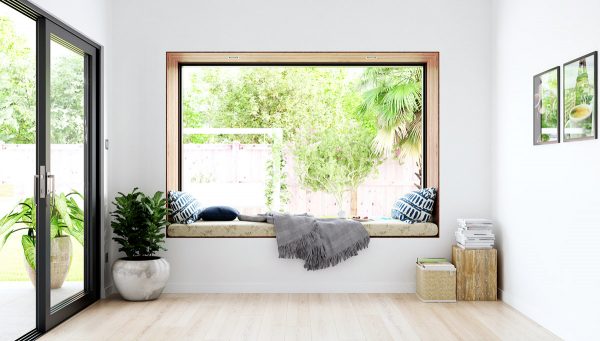
Every nook has a wooden lining – or at least this reading nook does anyway.
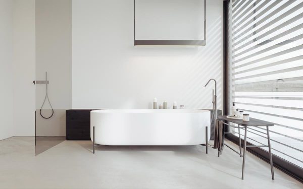
Visualizer: KUOO Architects
A tinted shower screen sections the white space in this luxury bathroom.
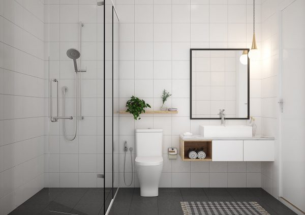
Visualizer: 365 Design
Charcoal floor tiles ground this light bathroom scheme.
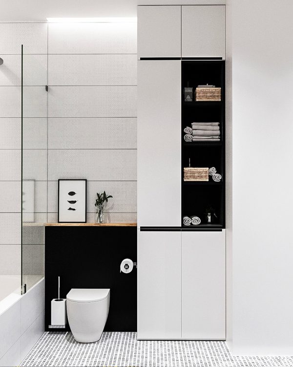
Visualizer: Zrobym
Be brave with chunky base notes of black to counterbalance white.
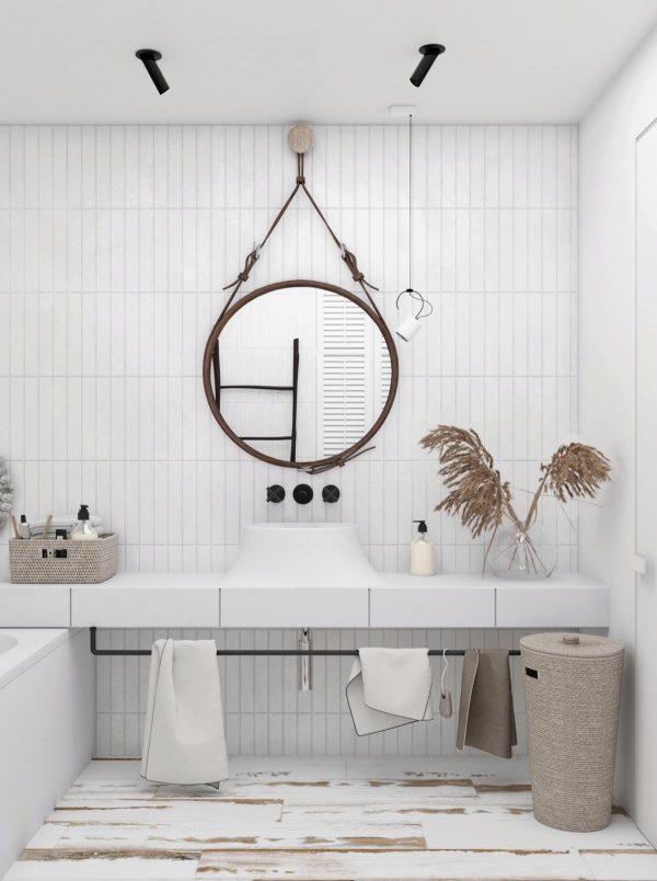
Visualizer: Home D
An all-white bathroom always looks clean and hygienic. However, a few natural elements like a unique laundry basket and a leather strap mirror pull in a little style. Note the beautifully distressed white painted floor too – gorgeous!
Recommended Reading:
30 White Living Rooms
32 White Bedrooms
30 Modern White Kitchens
Related Posts:
 Three Pretty Pastel Home Decor Schemes
 Vietnamese Interior by Grand Design
 4 Feature Rich Homes: Scandi Decor Inspiration
 Three black and white interiors that ooze class
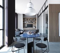 Chilled Out Modern Home in Muted Colour
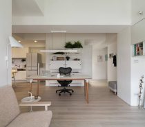 Completely White Apartment With Dominant Central Home Office
Source: https://ift.tt/2sAdqIi
white nightstand set of 2
ReplyDelete