In minimalist apartments that are short on space, it’s important to add personality to keep the living areas from feeling too stark. In these two apartments, pops of color make for eclectic living spaces that offer utility and style in a small package.
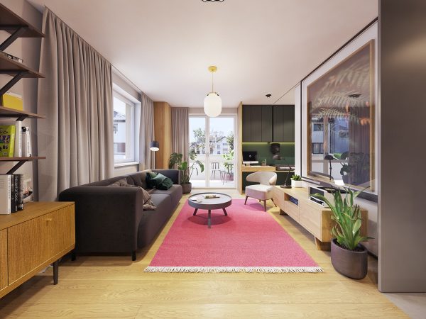
Designed and visualized by Polish firm Zarysy, this first apartment in the Krakow area of Poland measures in at 48,2 square meters shows that a smaller space can still have personality and utility. In this view of the view of the living area, you can see the large windows and doorway leading out to a balcony, giving plenty of light to the open design.

The modern coffee table in a round shape and curved accent chair sit on a plush pink rug that matches the pops of pink in the kitchen tile.
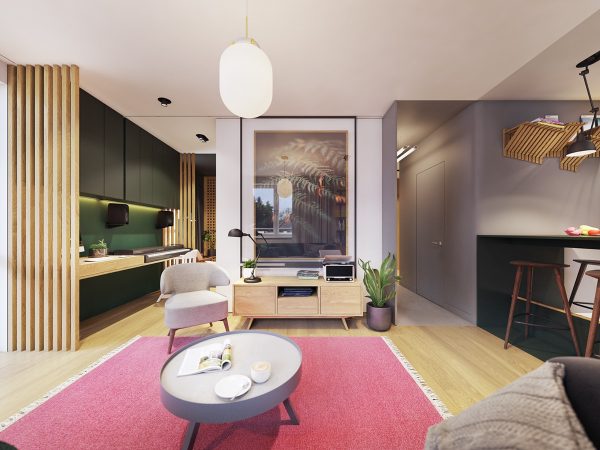
The living area opens into the bedroom with plenty of vertical cabinet storage, as well as the kitchen area and hallways, which uses matte grays as part of the neutral palette.

Tucked around the corner of the view is the bed, which gives the open floor plan a bit of privacy for sleeping. While compact, the space feels efficiently used and holds a playful charm.
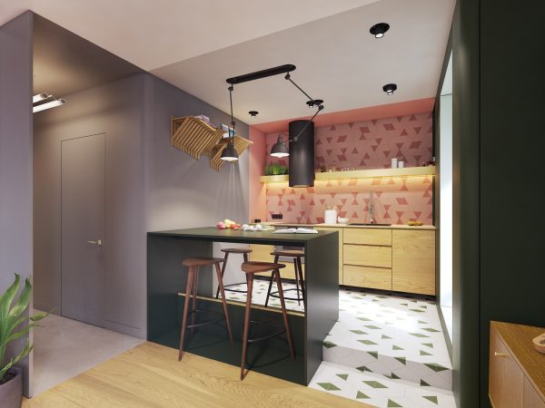
The creative tilework of the one wall kitchen brings together the green and pink found in other areas of the space.
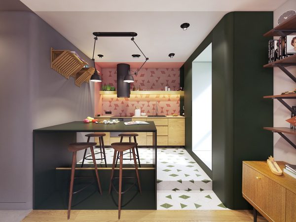
The diamonds and triangles in the floor and backsplash feel fresh and youthful. A two sided dining bar with modern kitchen bar stools complete the kitchen and dining area without making it feel crowded.

The light wood of the cabinets and even the cutting board cutting board add a natural sensibility to the sleek appliances.

Open shelving and flat cabinets against the cheery kitchen backsplash ensure that there’s enough room for essentials without making the space look cluttered.

One of the most interesting features of the space is that of the music area. Positioned in the entry of the bedroom, the long desk features plenty of space for both a digital keyboard and a computer.

One could easily imagine the composer hard at work before retiring to bed. Vertical shelving alongside the bed along with decorative sliding closet doors ensures that his or her belongings are safely stowed. Mirrors lend the appearance of an even larger space.

Instead of a headboard, this modern bedroom uses a large graphic with soft blues.

The grays, pinks, and light wood found in the rest of the apartment show up again in the bedroom chair, flooring, bedding, and draperies.

The entrance to the bedroom from the hallway and entryway is finished in a light seafoam green – a calming color choice for crossing into a space of respite.

In the hallway entryway, the long upholstered bench and large artwork adds pops of pink, used smartly as an accent color alongside the gray and green.

A small console table provides a bit of shoe storage while white decorative hanging hooks provide the perfect spot to stow jackets, hats, and scarves.

Natural woods continue to play center stage in the flooring and doors of the apartment.

The bathroom has almost a graphic artist feel with varied patterns, textures, and colors that still work beautifully with the rest of the space.

A natural wood vanity offers storage and utility for toiletries, but it’s the shower that draws the eye in. The black and white of the tile is clean, modern, and visually engaging as two patterns run along the back wall, side walls, and floor.

Unlike most bathrooms, this space uses table lamps on the vanity to shed a little extra light.

The pink accent color also makes an appearance as an accent wall in the bathroom, next to the clever litter box space.

In another design by the same firm in the Gdańsk area of Poland, this 66.6 square meter apartment showcases streaks of green and unique light fixtures within a neutral backdrop. The living room is anchored by a modern sofa. A coffee table, similar to this expandable one, offers ample space. A great room for entertaining.

In this open space, living and dining blend together seamlessly with a sleek one-wall kitchen. Soft dining pendant lights provide a natural divide over the table, which uses the same light wood found in the living room’s modern coffee table.

Large windows along the kitchen and living area walls let light stream into the space. White walls and ceilings make it feel airy and open, even though three key living spaces are combined into one room in a smart use of space.

A reading nook along the open bookshelves faces the entertaining area, offering extra seating when needed.

The herringbone pattern of the hardwood floors creates a focal point in the otherwise minimalist space. It contrasts nicely with the calm neutrals in the kitchen area.

The soft glow of the pendant lights makes the already bright apartment feel inviting. The kitchen offers a full view of the living area and dining table, making conversation during mealtimes effortless.

Flat cabinets in the same light wood of the dining table and white counter tops in this galley kitchen carry the lightness found in other areas of the space. While compact, it is functional with plenty of storage.

The hallway leading to the kitchen marries in the same smooth matte tile, drawing the eye toward the window.

This organized entryway with open shelving and a wall of decorative wall hooks offers practical storage and style.

A cozy ottoman below the wall pegs offers seating near the entry of the apartment.

The double workspace features the same herringbone hardwoods from the living room. It’s long and narrow, but a smart use of space with upper and lower storage.

Lighting beneath the cabinets and open shelf creates a warm glow over both workspaces.

In the minimalist bedroom, an upholstered wall feature acts as an unexpected headboard alternative. On either side of the bed, bedroom pendant lights cast soft glows over the green nightstands.

Also unique to this minimalist bedroom design is the neon light fixture along the wall opposite the bed.

It’s a functional stand-in for other wall art and adds additional light to the already cozy space.

Finally, in the bathroom, a pop of yellow adds personality over the modern bathroom vanity.

Like the yellow swing arm wall lamp, a shower bench in a similar sunshine shade makes this already bright and light shower feel cheerful.

The transparent glass wall offers a full view of the space, including the beautiful diamond tile pattern.

A green accent wall shows that unique wall clocks have a place in bathrooms as much as they do other rooms in a modern apartment. Overall, this is yet another example of how pops of color can make a neutral palette in a minimalist space feel so much more personal.
Loved this apartment? Here is another one from the same architects: A 60s-Inspired Apartment with a Creative Layout and Upbeat Vibe
Related Posts:
 4 Small Apartment Designs Under 50 Square Meters
 Stylish Apartment in Germany [Visualized]
 A Luxury Apartment with Comfortable Furniture and a Double Height Ceiling
 2 Apartments Under 30 Square Metre – One Light, One Dark
 Flowers on Balconies
 Cute and Groovy Small Space Apartment Designs
Source: https://ift.tt/2RqU1nN
No comments:
Post a Comment