Minimalist white interiors are effective – often used to highlight architectural concepts, to showcase furniture and accessories, and to serve as a blank canvas for those who seek inspiration. But these interiors can also stand alone as works of art. Skilled designers can strike that perfect balance of minimalism without sacrificing an ounce of charm, weaving a rich and elegant tapestry using only the most straightforward elements. The two apartments below, designed and visualized by Z Design, showcase minimalist white spaces that capture the imagination through two of these essential elements: light and texture.
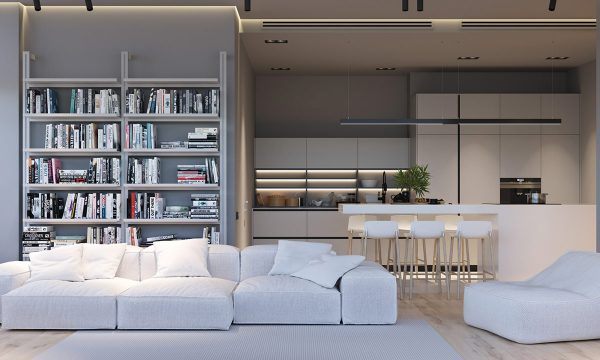
The first apartment opens with a living room for a book lover. Note the drama of the indirect cove lighting, how a functional addition creates tremendous aesthetic appeal. It draws the architecture of the room to the forefront and helps to warm the cool color palette.
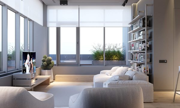
This space uses no extraneous decoration outside of the books and the cactus planter. Each well-designed object captures full attention, demonstrating beauty through pure functionality – like the soft plush shapes of the inviting modern sofa.
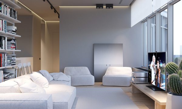
Even the artwork is minimalist. This piece echoes the straight lines and gentle greyscale palette of the room.
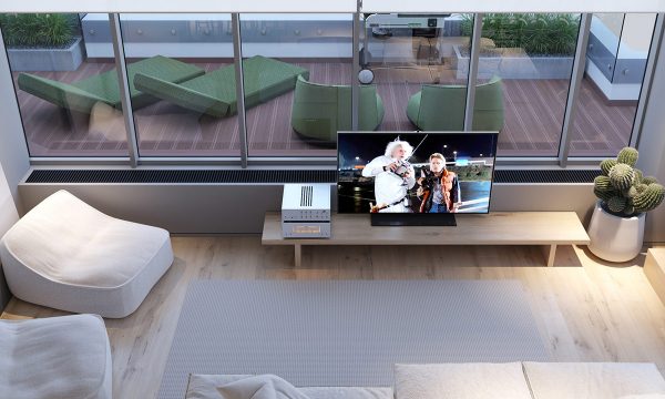
While the interior adheres to a strict absence of color, the patio embraces its verdant surroundings.
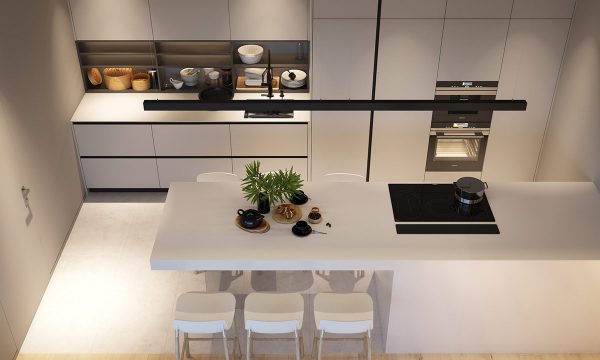
The galley kitchen also uses light in fascinating ways. Without windows, the indirect cove lighting paints each surface with dynamic highlights and shadows.
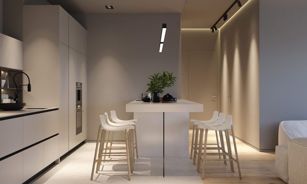
A linear suspension light provides even illumination over the dining surface. Its black finish continues the strong horizontal lines that carry the eye through the kitchen.
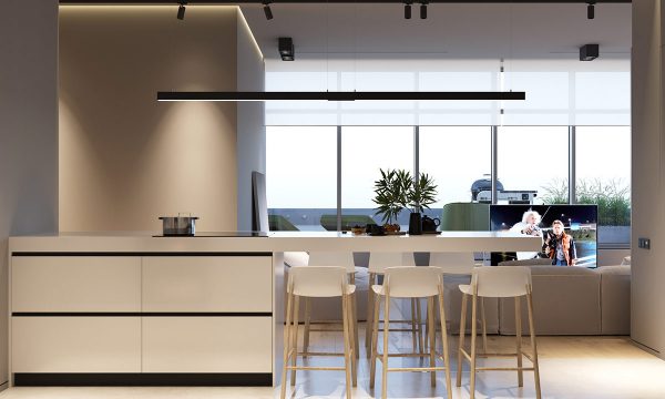
These kitchen bar stools play an important role in drawing the two spaces together. The white seats perfectly match the surfaces that surround them, while the wood legs create continuation between the kitchen and living area.
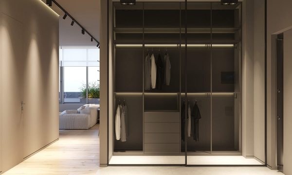
At the entryway, a large glass-encased closet provides easy organization for jackets and accessories. More cove lighting transforms this space from a dark cubby into a stylish statement.
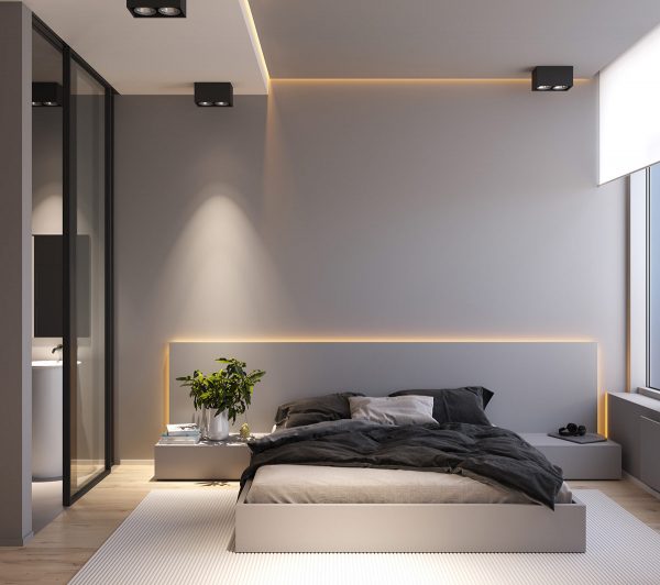
Clever lighting techniques bring ambiance to the modern grey bedroom. Here the cove lighting takes on a more yellow tone, infusing this space with calming warmth for a more welcoming atmosphere.
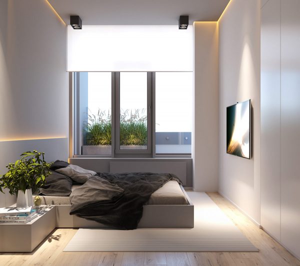
A dash of verdant greenery breaks up the minimalism of this space. The foliage in the decorative vase ties neatly with the grasses just outside the window.
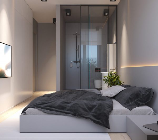
Thanks to the glass partitions, the ensuite bathroom can still enjoy the bedroom’s natural sunlight and window view.
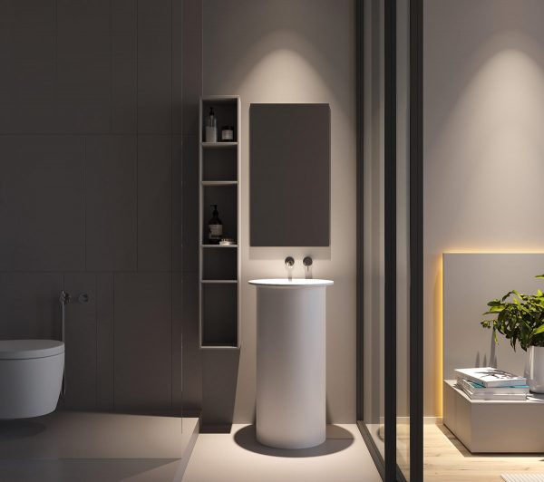
Because the bathroom is visible from the room, it makes sense to hold this space to a higher stylistic standard. Even the unique bathroom sink maintains an artful minimalist profile.
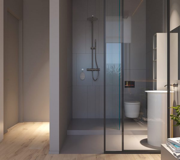
This ensuite bathroom concept may not be practical for every situation but it does offer picturesque inspiration.
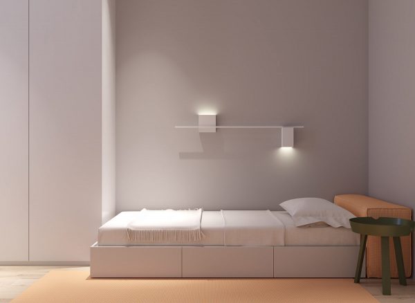
Another bedroom offers a more casual vibe. It starts simple with a low-profile storage bed, its headboard a plush block upholstered in orange. Creative modern wall sconces provide ambient and direct illumination.
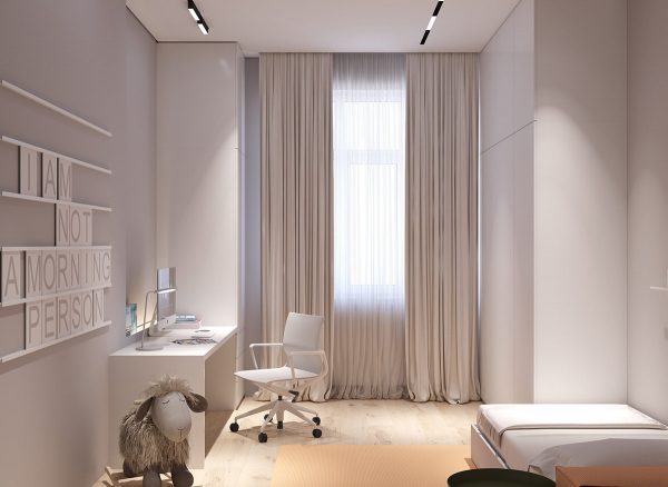
Minimalist design does not stop this space from feeling approachable enough for a child or teen. Natural neutrals offer warmth while pastel orange accents add a playful twist.
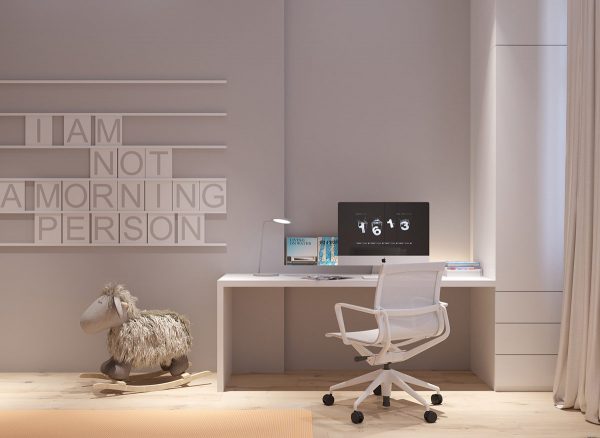
Every child is different. Sometimes children flourish surrounded by colorful inspiration, while others find it easier to focus in a comfortably simple environment. This kid’s study includes only the essentials – a spacious desk, a task light, and an ergonomic kid’s chair.
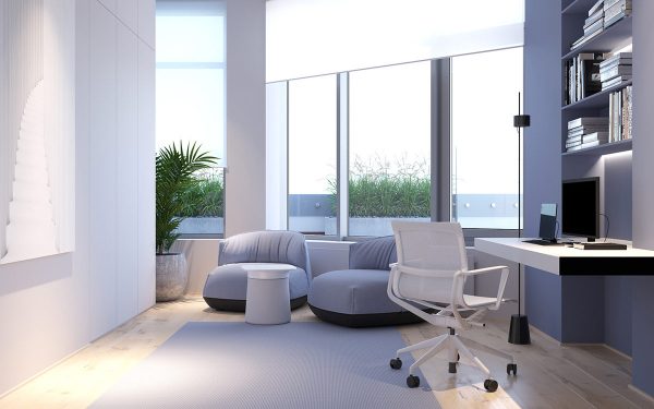
The modern home office includes packed bookshelves illuminated by stylish cove lighting, right within reach from the wall-mounted desk. The desk chair can easily roll over to the small lounge area for meetings with clients and colleagues.
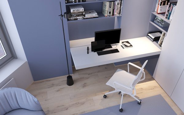
Wall-mounted desks are a favorite technique for creating a minimalist workspace look.
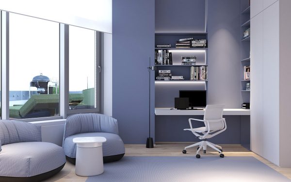
Using an adjustable floor lamp conserves precious workspace compared to a desk lamp. This one can be raised and lowered as needed to provide general illumination or direct task lighting.
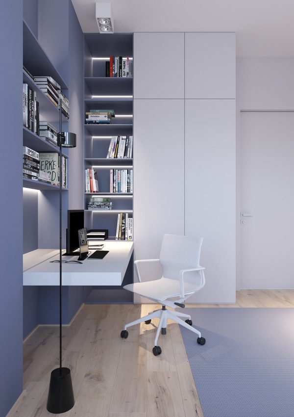
Even more storage hides within the wall of white cabinets, making it easy to keep the office looking neat and tidy for effective concentration.
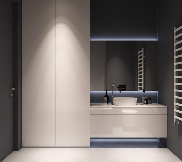
This grey and white bathroom makes a dramatic statement through contrast. Direct lighting illuminates the face of the cabinetry, making it stand out even more from the darker walls that surround it. The mirror glows with a border of indirect lighting to create a sense of depth and dimension.
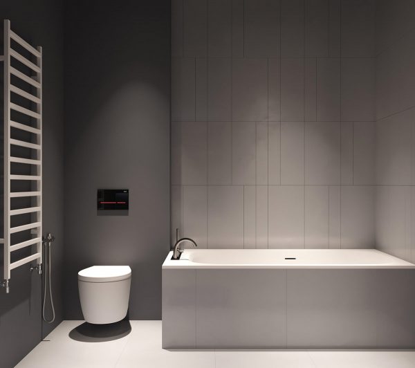
On the other side of the bathroom, the downlights play a more functional role.
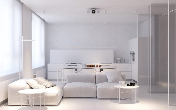
While the previous home emphasized lighting, this one focuses on creating character through the creative application of texture. The diverse texture palette invites extensive visual exploration – easily preventing this minimalist interior from feeling stark or empty.
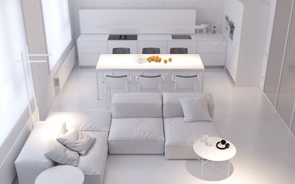
The open concept living space uses texture and shape to define its boundaries. The kitchen is composed of sharp clean lines and smooth surfaces, while the living area takes a softer approach with its plush modern sofa and round side tables.
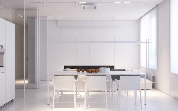
This white dining space is illuminated by a matching linear suspension light, only barely visible against the white background – a fantastic way to achieve even lighting without the visual interruption of a more substantial piece.
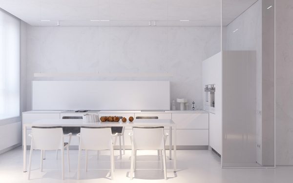
The texture palette is subtle but inspiring. All wall cladding features subtle grey veins like marble, allowing the pristine backsplash and cabinetry to stand forward with more emphasis.
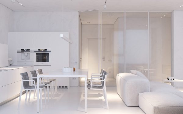
In terms of texture, the modern dining room bridges the divide between soft and sleek with its tastefully upholstered dining chairs and minimalist white table.
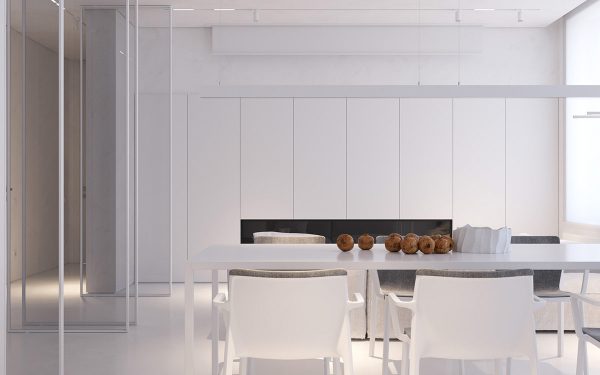
With such a central location, the table makes a great stage for color accents. Even a simple flower blossom could become a focal point.
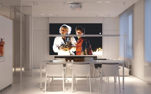
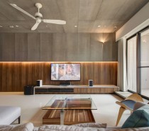
A projector is almost a necessity in the ultra-minimalist home. Here, the placement makes it possible to take in some casual entertainment or watch news with an evening snack.
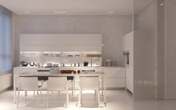
The cabinet doors lift upward rather than outward. This makes it possible to achieve a low easy-to-reach placement without disturbing the items on the countertop.
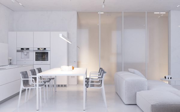
Sliding doors separate the public areas of the home from the private ones. When closed, the frosty finish adds yet another fascinating layer to the texture palette.
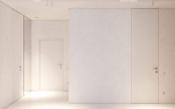
More marble-veined walls line the hallway.
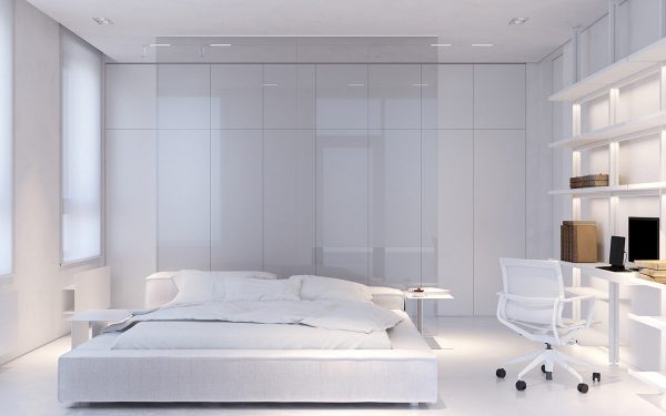
In the master bedroom, a large transparent pane serves as a striking alternative to a traditional headboard wall. This minimalist bedroom is packed with storage solutions, including open shelving that could become an oasis of colorful accessories depending on the resident’s preferences.
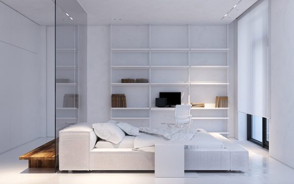
A workspace fits neatly within the wall of shelves. Reference materials are easy to access, with plenty of room left over for inspirational décor.
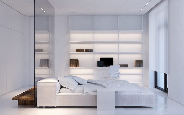
Indirect cove lighting brightens each shelf. Not only does this make it easier to find objects, it also provides soothing illumination for long nights spent working on projects.
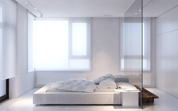
The platform bed features a low profile below the window ledge to maximize the amount of natural light entering the room.
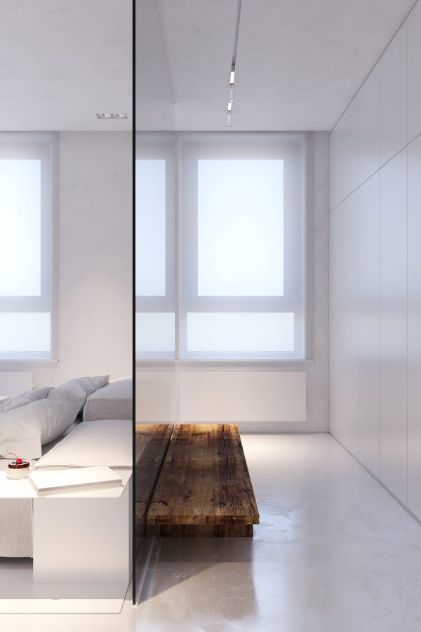
A wooden dressing bench stands out amongst the sleek surfaces, soft upholstery, and smooth glass that defines this space.
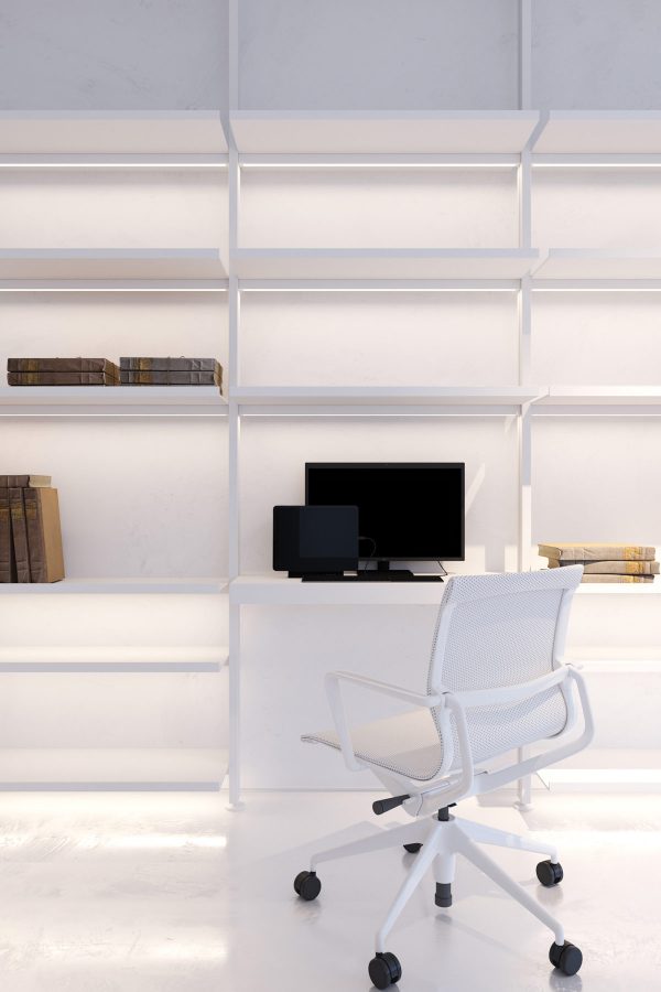
The mesh of the office chair is not just a practical choice here – it also maintains the light and airy look that defines this bedroom.
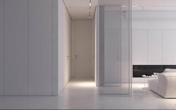
Considering subtle texture differences adds a dynamic quality to any interior, evolving throughout the day as lighting conditions change.
Recommended Reading:
40 Gorgeously Minimalist Living Rooms
40 Serenely Minimalist Bedrooms
40 Minimalist Dining Rooms
40 Minimalist Kitchens
Related Posts:
 40 Minimalist Dining Rooms That Will Leave You Hungry to Copy Their Style
 3 White Themed Homes With Striking Modern Minimalist Aesthetics
 40 Gorgeously Minimalist Living Rooms That Find Substance in Simplicity
 An Eclectic Minimalist Apartment
 Uniquely Intriguing Interior Spaces by Vic Nguyen
 Modern Apartment Designs by Phase6 Design Studio
Source: https://ift.tt/2LpvUGg
No comments:
Post a Comment