When living space is limited, it’s time to get creative – and it doesn’t hurt to move to a minimalist mind set. That’s what happened after the purchase of two homes in Japan. Unusual layouts and creative division of area brought about unexpected changes in floor height. The designs, by Indot Design, seek only to meet the basic needs of the homeowners, without faltering into a feeling of emptiness. Hidden storage compartments and sleek units keep the minimalist rooms free from the noise of clutter and colour. The interiors stand awash with calm and minimalist Japanese design, predominantly based in white with pale grey accents, and light wood elements to turn up the thermostat of visual warmth.
Photographer: Hey!Cheese
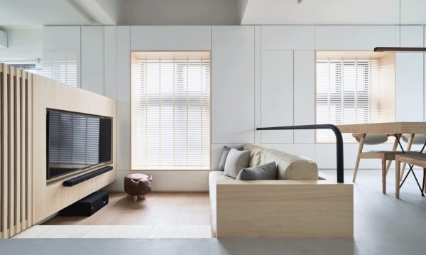
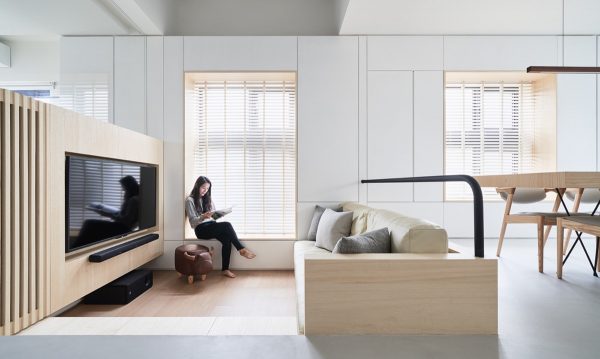
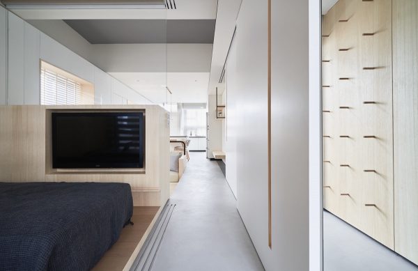
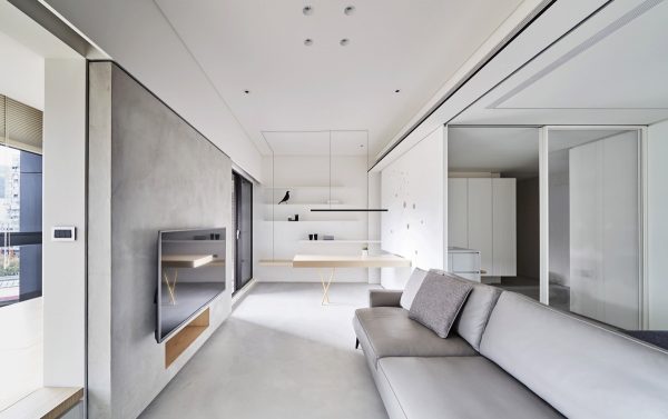
It’s not hard to see why this unusual Japanese home renovation won a micro space project award. Spanning a very narrow 60 square metres, this ingenious home design overcame great challenges by implementing creative zoning techniques. The minimalist living room beds down inside a recess in the floor, where a bespoke sofa design and TV wall make full use of its limited width. A Bull storage ottoman adds a little character.
The story of this home design began with a client who wanted to keep their elderly parents close to them, after their parents decided to downsize. A small and narrow house was purchased in the hope that it could become a comfortable and sociable living area, with enough space for other family members to come visit too.
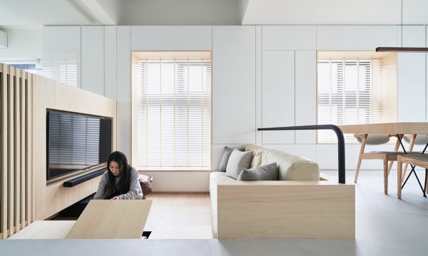
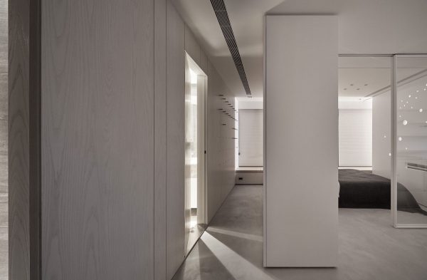
A step down into the lounge area conceals storage space beneath its tread. A wall of storage along one entire side of the house makes it possible to stow away items that would make the small area feel cluttered. The sleek white cabinets go almost unnoticed, and so aren’t oppressive on the narrow living space.
The change in floor treatment over the wide step is a safety feature to make it more visible.
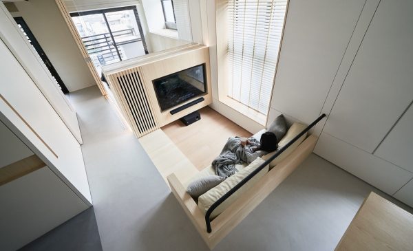
A safety barrier runs above the low set sofa. Armrests have been widened to be more noticeable in their low position. A grill in the TV cabinet increases ventilation.
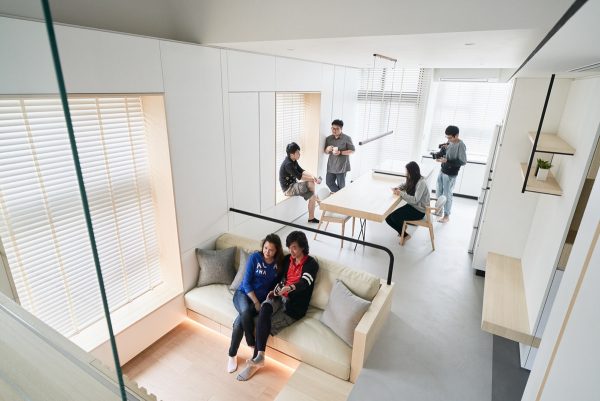
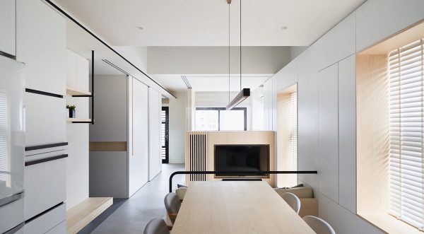
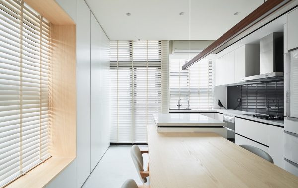
The kitchen diner is open plan with the living room, which means many people can socialise or watch a movie together.
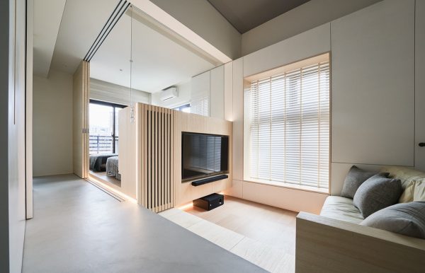
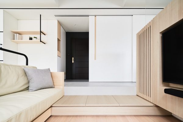
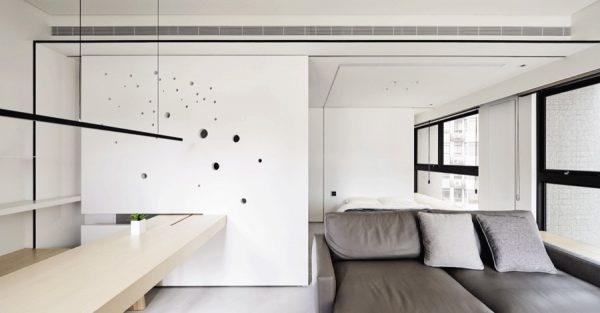
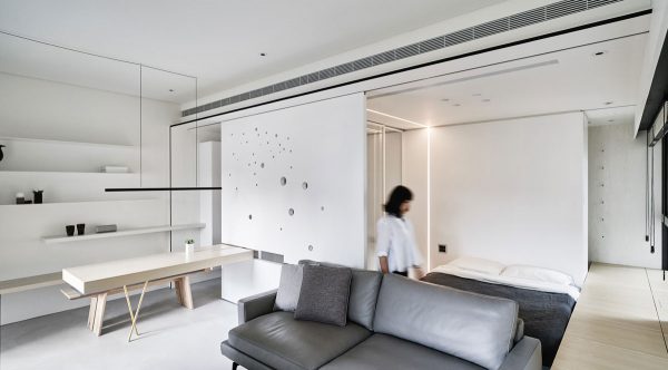
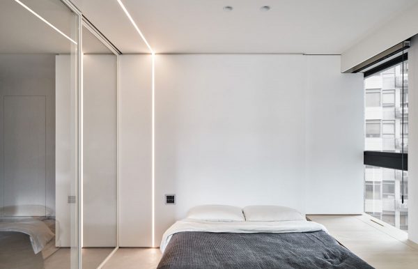
LED strips serve a night light function. The bedroom is situated behind the lounge TV wall with a glass partition. Its sliding doors allow the bedroom to be opened up to living space.
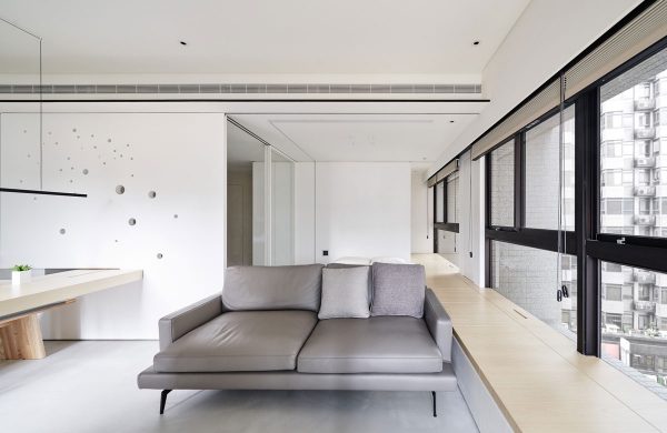
A bench is fitted to the wall along the open plan living room, as additional seating for guests.
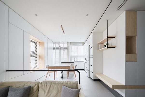
White kitchen cabinets pale into the background of the long room, pushed to the outermost corner to leave a large sociable area where many people can gather and chat.
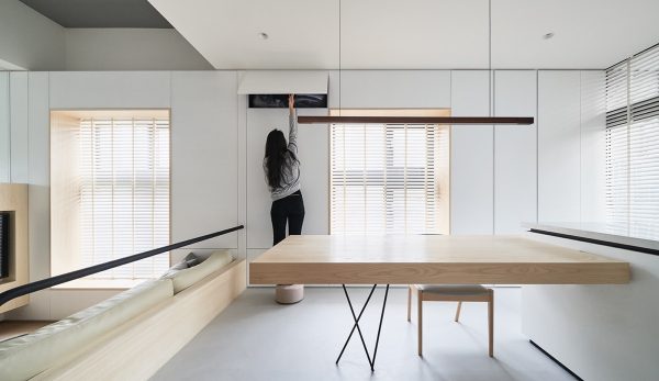
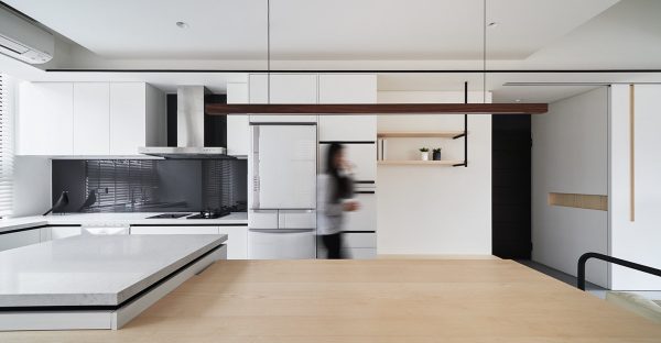
A large dining table was paramount for big family dinners.
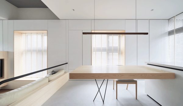
The minimalist dining table is extended by the adjoined kitchen island.
Window wall storage units serve as kitchen cabinets too.
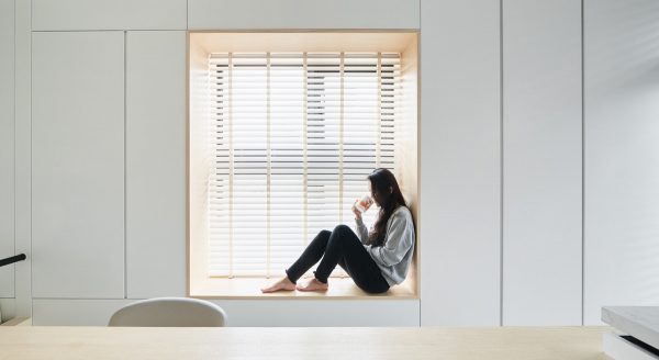
The depth of the storage units form deep window sills that double as comfortable window seats. Seating locations across the home, over different heights, form intermediary spaces to sit and stay–and places where family members can come gather together again.
A stylish cut puts the kitchen island right inside the dining table.
Above the table, a simple linear suspension light suits the minimalist aesthetic.
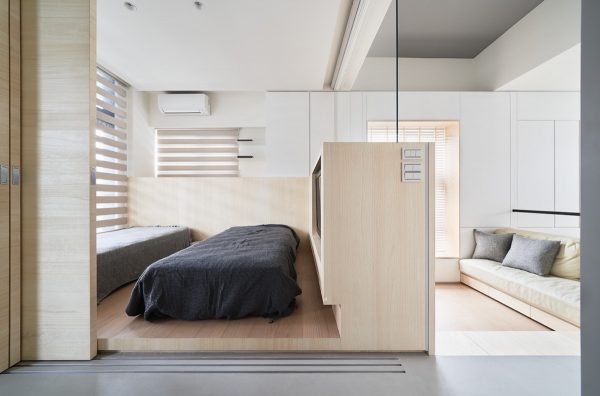
With the sliding room divider retracted, we can see the living room TV wall doubles as a bedroom TV wall on its opposite side.
To save space in the elevated bedroom ‘box’, the bed bases were discounted; mattresses lay directly on the floor.
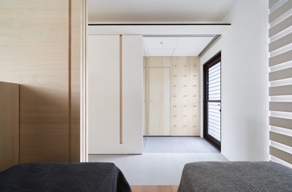
One walkway links the spaces, with an Italian floor coating. The bathroom stands opposite the bedroom.
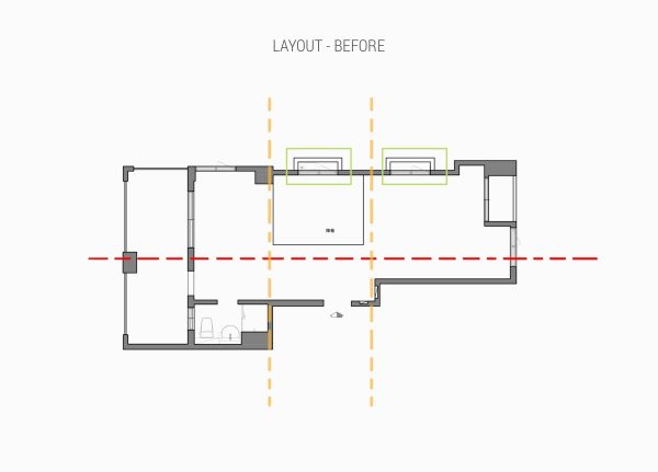
Original floor plan. The recess at the centre inspired the core positioning of the lounge.
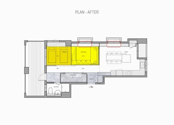
Finished floor plan. On the entrance side, we see there is a wardrobe combined with a locker room, which creates a porch interface.
In Taipei, Taiwan, an overcrowded urbanized environment enforced limitation of space for our second set of homeowners. Although the area was static, life had to be allowed to change and flow between work and leisure time.
It’s difficult to control the distance between people in a bustling city–and in this home of just 60 sqm. However, a dynamic solution brought about freedom. After taking all partitions back to zero, the designers built a predominantly open field with few obstacles. Then, sliding walls were installed that could either separate or integrate the space.
Large furniture items were placed flush with the sliding doors, and some pieces even slip into specialised slots cut into the moving planes.
The boundary of space is blurred and gentle. The living room is sometimes adjoined with the workspace, and at other times with the bedroom.
A raised wooden walkway begins up by the pillows in the white bedroom, and runs the length of the window wall. Storage compartments are hidden inside the platform.
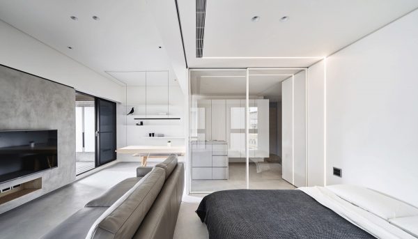
Glass sliding doors separate the bedroom from the kitchen side.
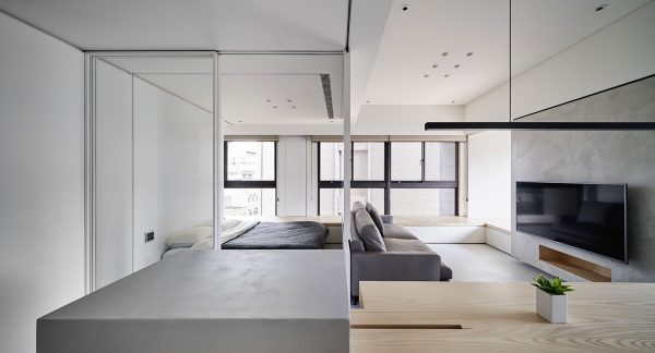
The homeowners can reconsider the division of space in a moment, and change public and private sectors.
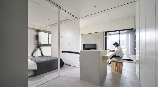
The partitions add both attractive and practical options for layout, where every day can ring the changes.
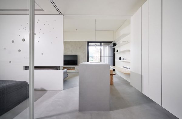
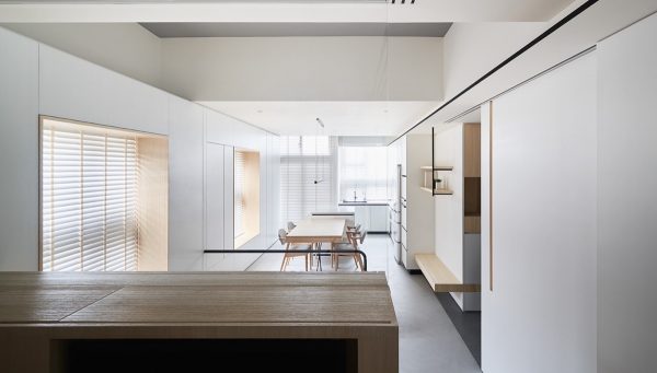
The kitchen disappears behind full height white cabinet doors.
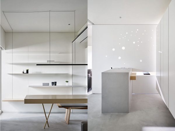
Cheese holes in the thick sliding door allows borrowed light to permeate and form fascinating soft shadows.
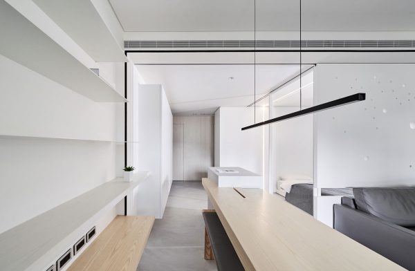
Simple white shelves back the work/dining area.
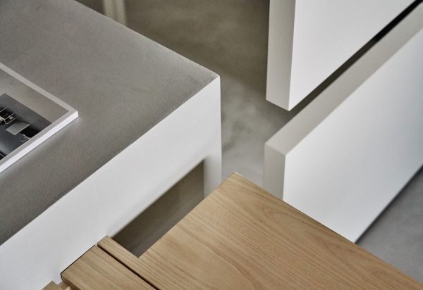
Perfect cuts make transitions effortless.
Here are the video tours of both these homes:
Related Posts:
 4 Apartments That Absolutely Nail The Grey Shade
 Four Perfectly Pale Scandi Style Interiors
 Black, White and Wood: Two Masterclass Homes of Contemporary Style
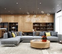 Color Combo Inspiration: Wood Interiors With Grey Accents
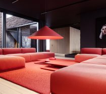 Two Luxury Single Family Houses With Red And Grey Decor
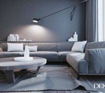 White & Grey Interior Design In The Modern Minimalist Style
Source: https://ift.tt/2ZsNn7k
No comments:
Post a Comment