Sometimes the restrictions presented by minimalist interior design can open the door for powerful methods of visual expression. Setting concise boundaries often results in those boundaries being pushed, pulled, and elegantly redefined. These two studio apartments take minimalism seriously, yet they stand in perfect opposition to the misconception that minimalism must mean plain or boring. Instead, these apartments gain decorative value from many unconventional techniques – in these cases, through the creative use of geometry and shape. Which one is your favorite?
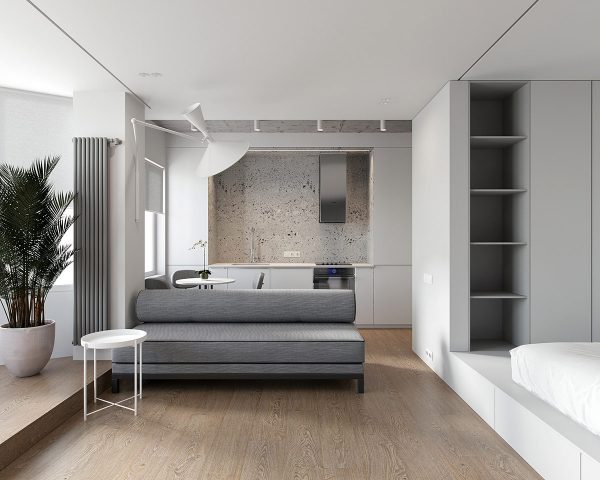
Designer: Studio Open Visualizer: Studio Open
Studio Open designed and visualized this Moscow studio apartment to fit within a footprint of only 38.02 square meters. Minimalism is especially well-suited for small spaces like this, but it also means there are fewer ways to create a distinctive impact. Here, the modern sofa sets the tone for the theme – a space based on rounded shapes, cylinders, and circles throughout.
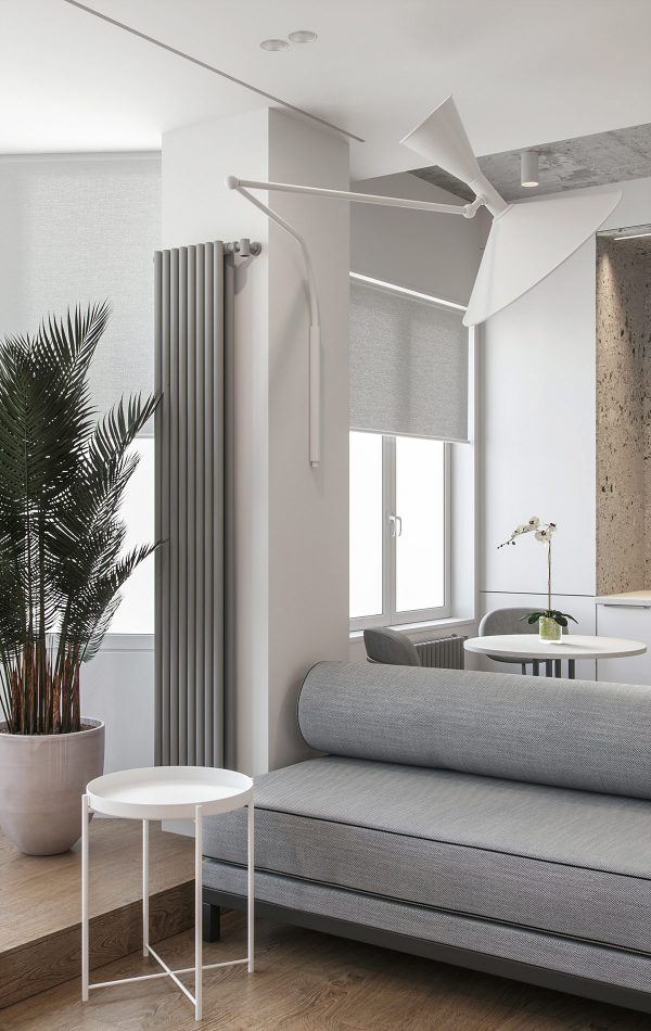
Right away, circular elements immediately draw the eye – from the small side table to the unique swing arm wall lamp. Even the indoor plant is potted in a rounded container.
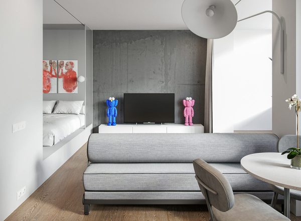
The grey living room exhibits tremendous character despite its monochromatic palette. Darker concrete in the living area adds depth and texture, while playful KAWS style dolls bring in a splash of color.
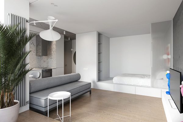
A simple bedroom shares the space.
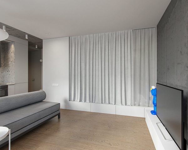
Draw the blackout curtain to make the living area feel cleaner and more streamlined in the daytime or block out noise and ambient light at night.
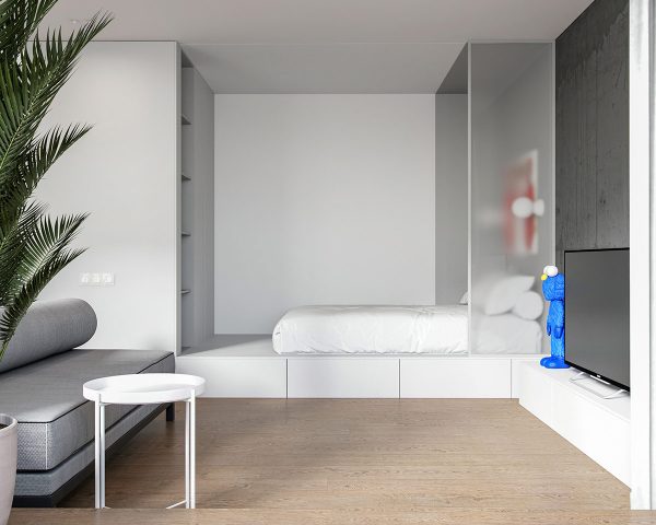
Drawers offer extra storage for linens beneath the bed. Open shelves and a private wardrobe keep essentials contained neatly.
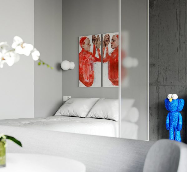
Art makes the bed space feel more personalized. This diptych is titled Defense Mechanisms by Emma Hopkins.
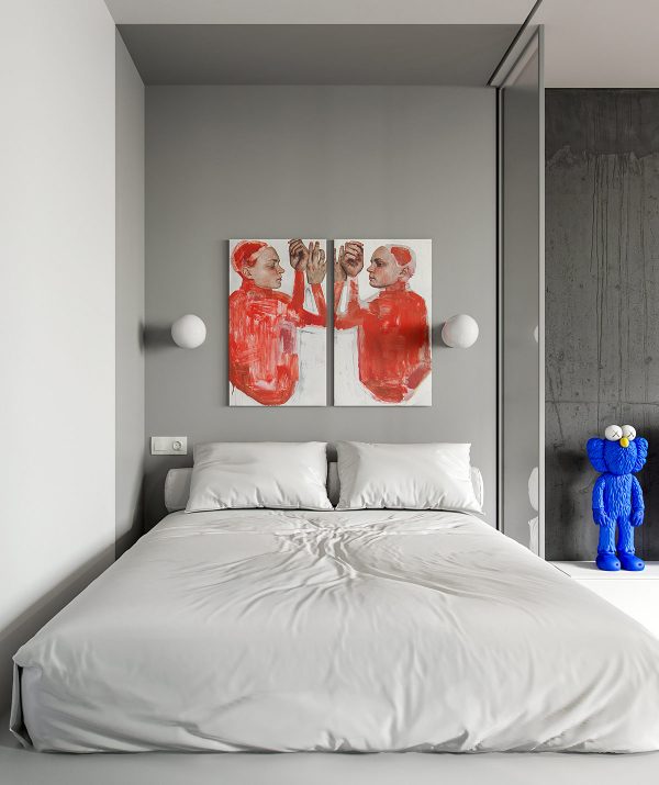
You can see the circle theme continued with subtle details in the bedroom. A cylindrical body pillow serves as a headboard for the floor bed design, perfect for a little nighttime reading with round modern wall sconces above to illuminate the pages.
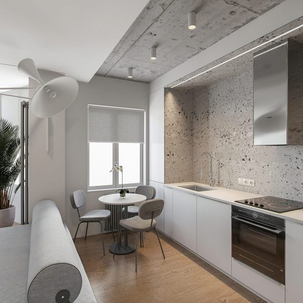
A small dining area sits tucked between the window and sink. Rounded chairbacks and a round dining table continue the geometric theme.
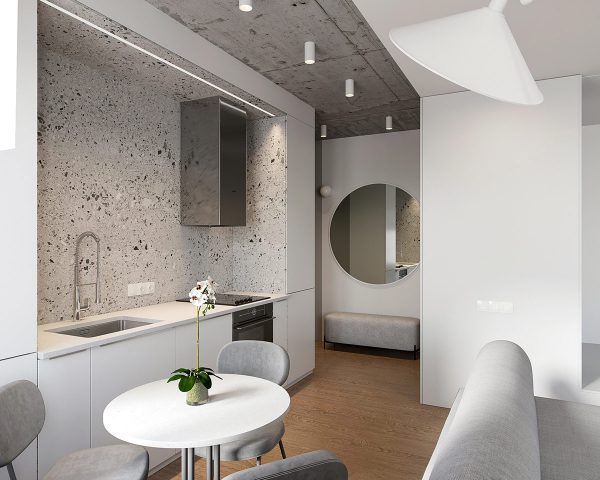
Where everything else is smooth and rounded, the kitchen stands out with its clean angles and boxy geometry.
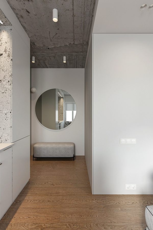
Yet the rounded theme returns within the hallway. A circular wall mirror stands above a stylish bench constructed with subtle curves.
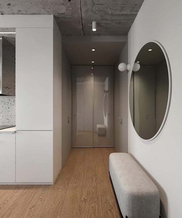
The bathroom is tucked behind the leftmost door, with the main entrance on the right. Sliding doors offer access to a closet.
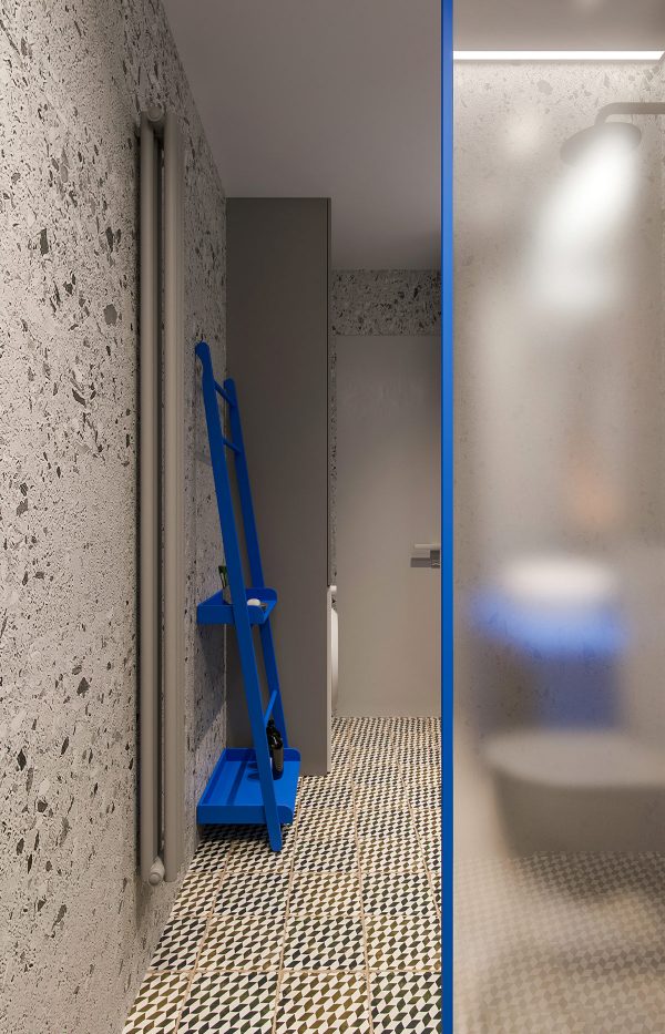
Immediately, the bathroom reveals itself to break the monochromatic theme of the living space with bold hues, like the cobalt blue of this convenient ladder shelf.
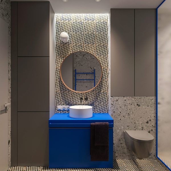
One thing remains the same – rounded accents.
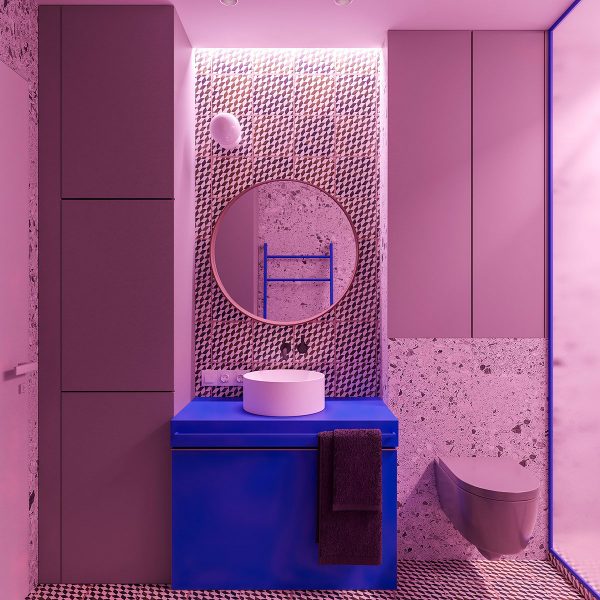
Dynamic RBG lighting can change the mood of the bathroom on demand.
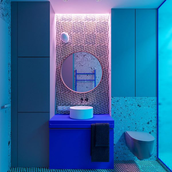
This view shows the shower lights tinted blue with the over-sink lights tinted pink. Combined with the geometric wall tiles, this space has a certain vaporwave aesthetic.
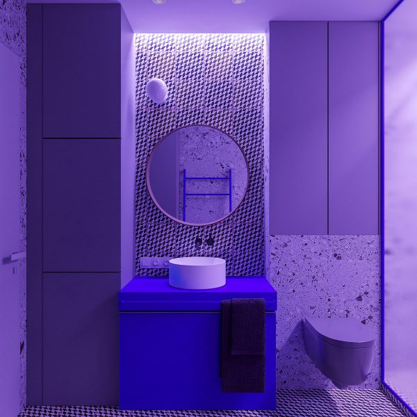
A look at this space with the purple light setting! In color psychology, purple is often described as a color that is both creative and calming – a nice way to set a daring mood before a night out.
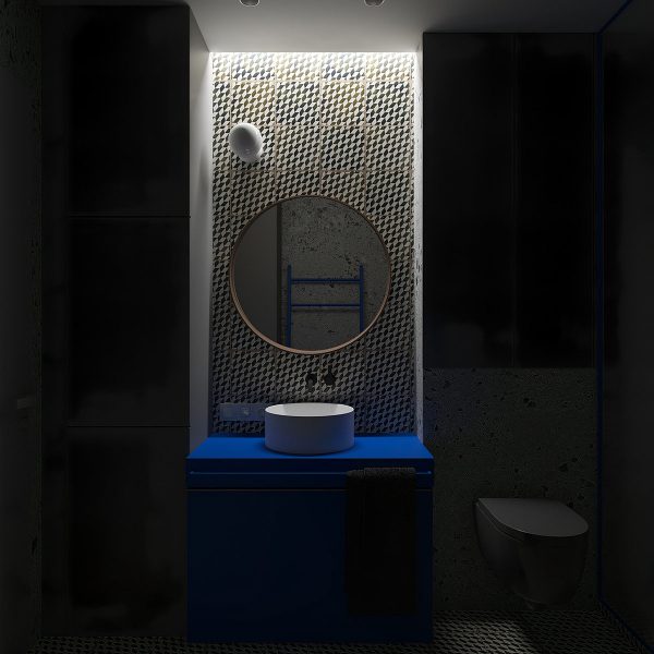
And finally, a look at the room with ordinary white light restricted to the vanity area.
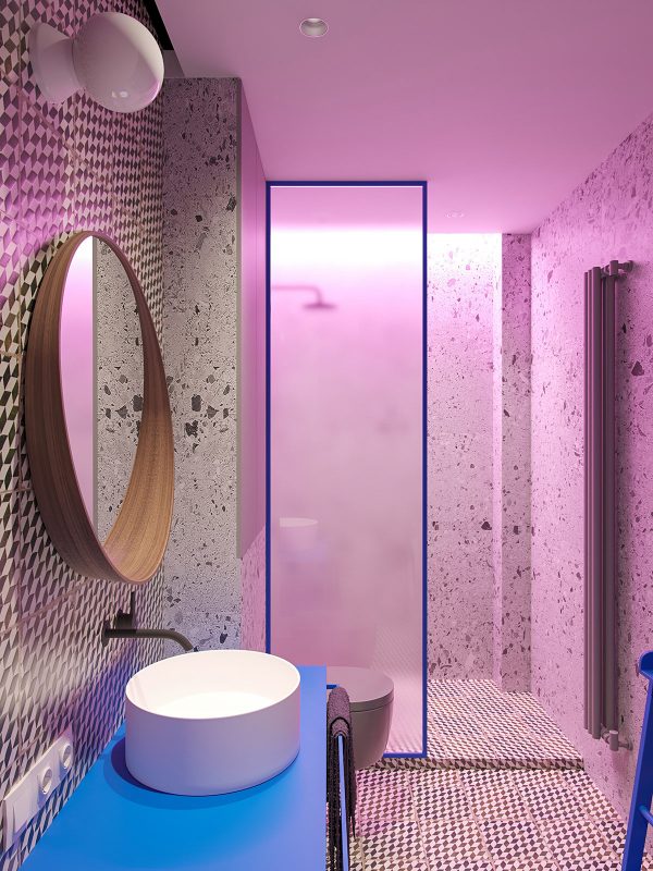
A simple half-wall divider gently diffuses the light across the bathroom.
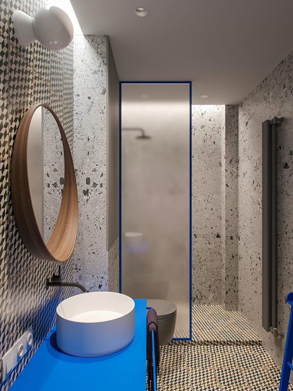
You can get this vanity look without spending designer prices with the Ikea Stockholm mirror.
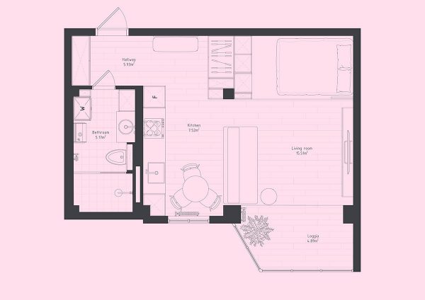
To wrap up this first tour, here is a nice floor plan to show how each area of the home fits together.
Designer: Yana Demidovich Visualizer: Vladyslava Torhonska
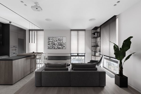
This next space was designed by Yana Demidovich and visualized by Vladyslava Torhonska. While the first studio apartment emphasized rounded elements, this one keeps things sleek with the boxy rectangles and the occasional thin cylinder.
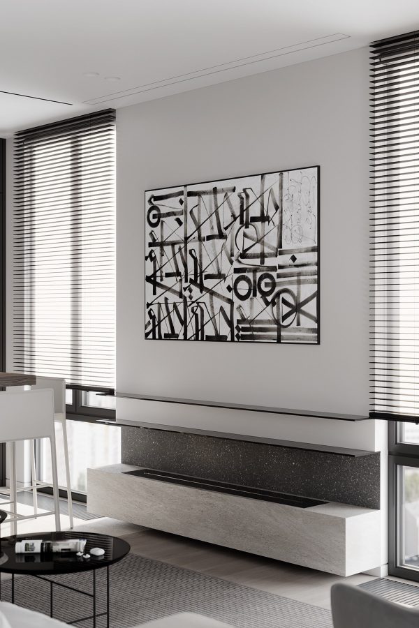
You can see the line and cylinder theme brought together with a large print that hangs above the modern fireplace.
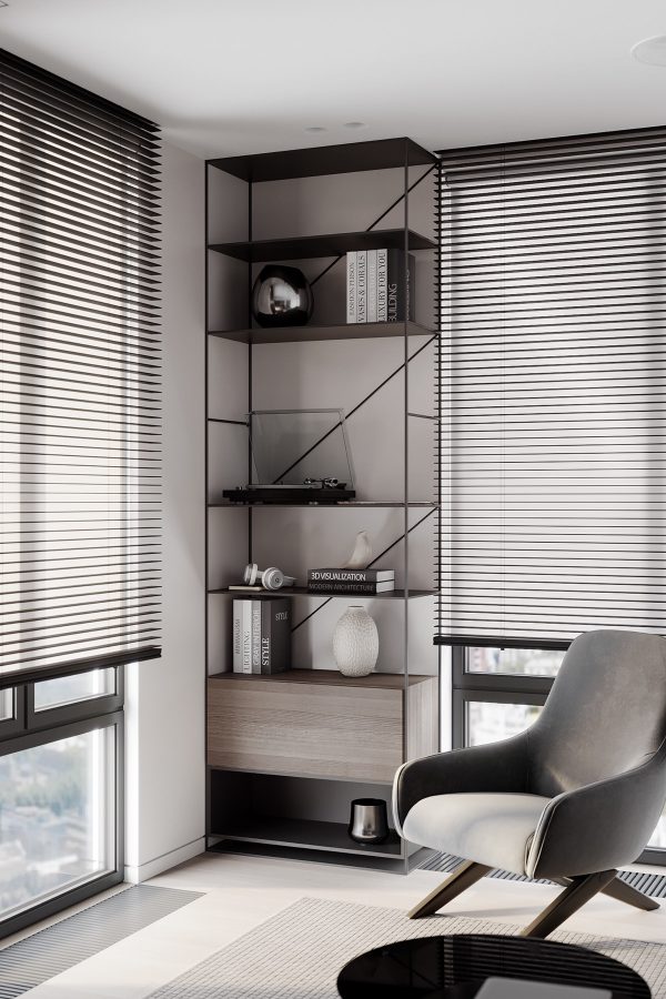
A streamlined industrial shelf provides attractive open display for items like the bird figurine and decorative vases – the enclosed cabinet could hold the headphones in the absence of a cool headphone stand.
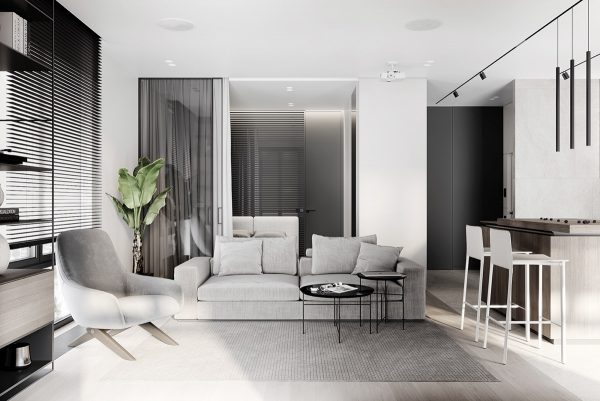
Details like the lounge chair and nesting coffee tables do break up the straight lines with a few well-placed curves. The tables are from the Sen Collection by Kensaku Oshiro.
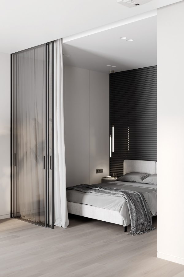
A glass wall bedroom continues the monochromatic palette, strong lines gracing the white sides and black feature wall.
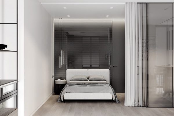
Combining glass and blackout curtains provide flexibility. Close only the glass for sound reduction while letting sunlight penetrate, or close only the curtains to block sunlight while preserving fresh air circulation.
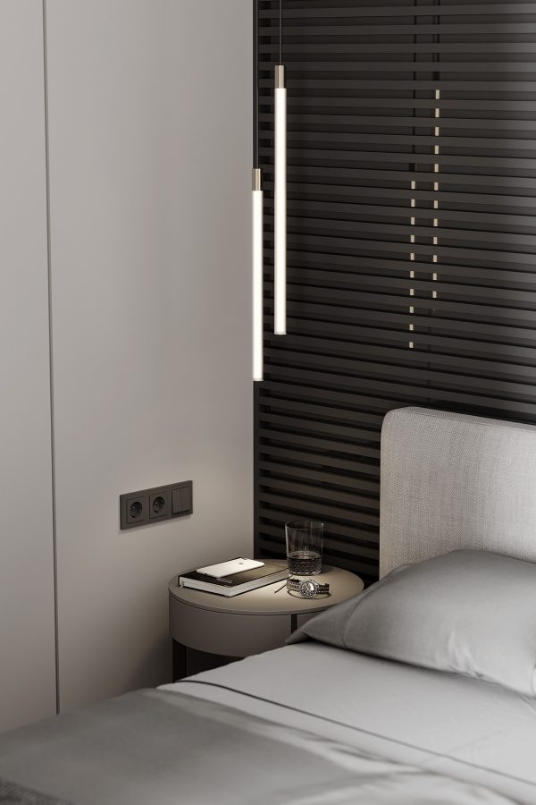
Cylindrical bedroom pendant lights illuminate the side table, keeping its surface free for everyday essentials.
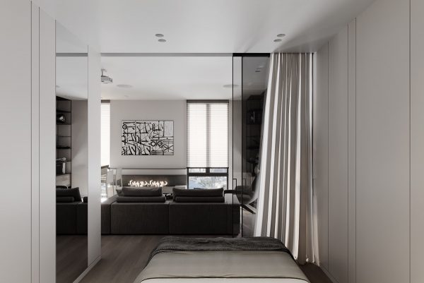
The bedroom’s tucked-away location provides a nice blend between privacy and openness, feeling much larger with its dividers left open.
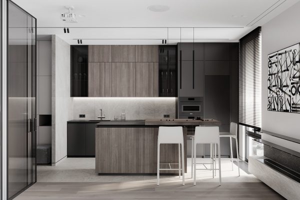
Across from the living area, a one wall kitchen gains expanded utility with its island and breakfast bar combination. Simple kitchen bar stools provide seating or can be moved into the living space as extra seats for guests.
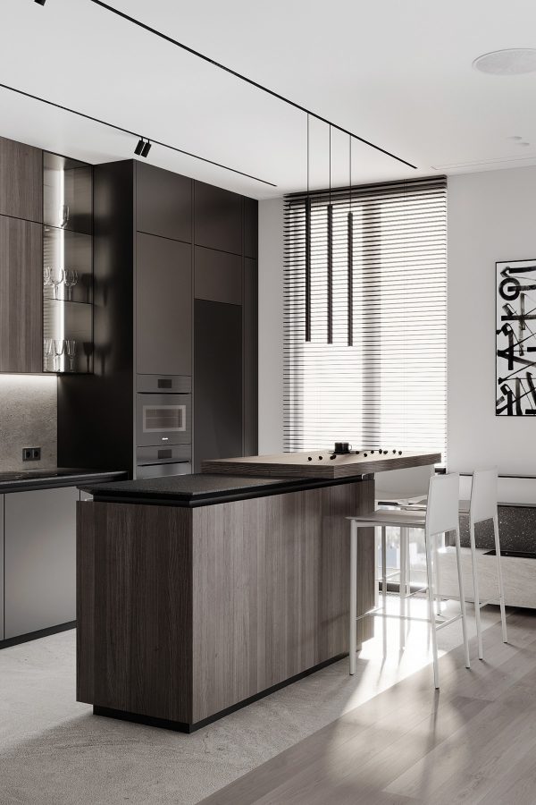
Several lighting options illuminate this space. Residents can grab a coffee cup and relax illuminated only by the sunrise and subtle cove lighting above the countertops, or turn on the unique kitchen pendant lights for direct illumination over dinner.
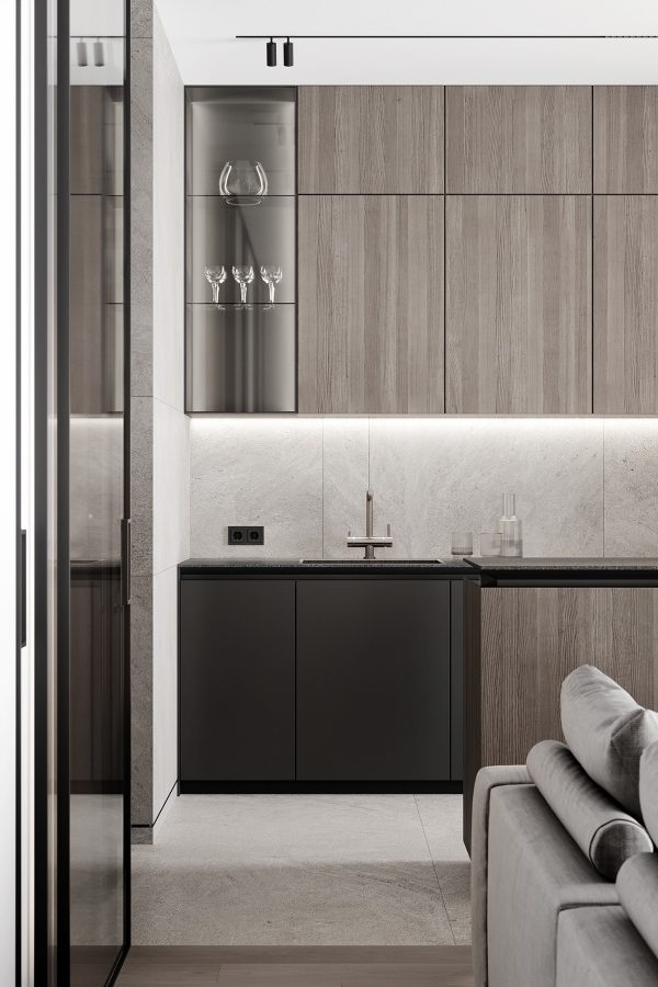
The storage solutions are elegant. Glass-fronted cabinets offer display space for attractive items like wine glasses and carafes, while ample enclosed cabinets fill the home with the warmth of their neutral wood grain finishes.
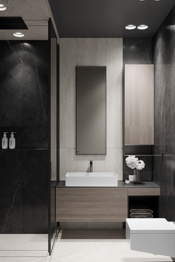
Now for a look at the bathroom. This space continues the look of the main studio environment, with its cabinetry and modern bathroom vanity matching the finishes in the kitchen.
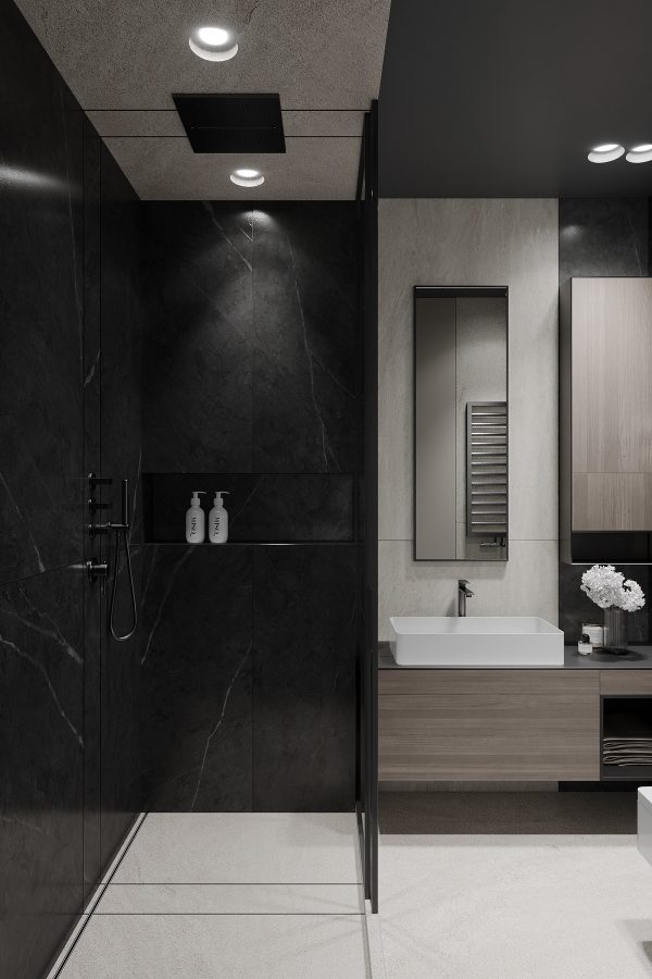
The shower is enclosed by a transparent glass door, with black hardware over black cladding for a sense of clean minimalism.
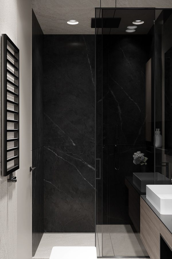
Black stone with thin white veining adds a touch of luxury that really elevates this space beyond the utilitarian.
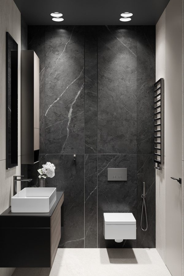
Because the stone cladding embraces the bathroom on each side, it works to make the space feel warmer and more intimate while providing an undeniable sense of luxury.
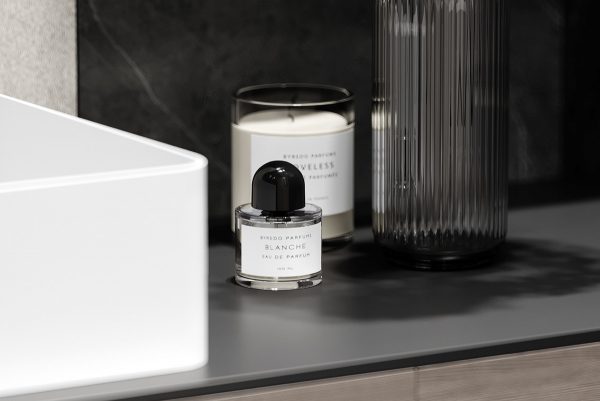
A small portion of open countertop holds essential accessories.
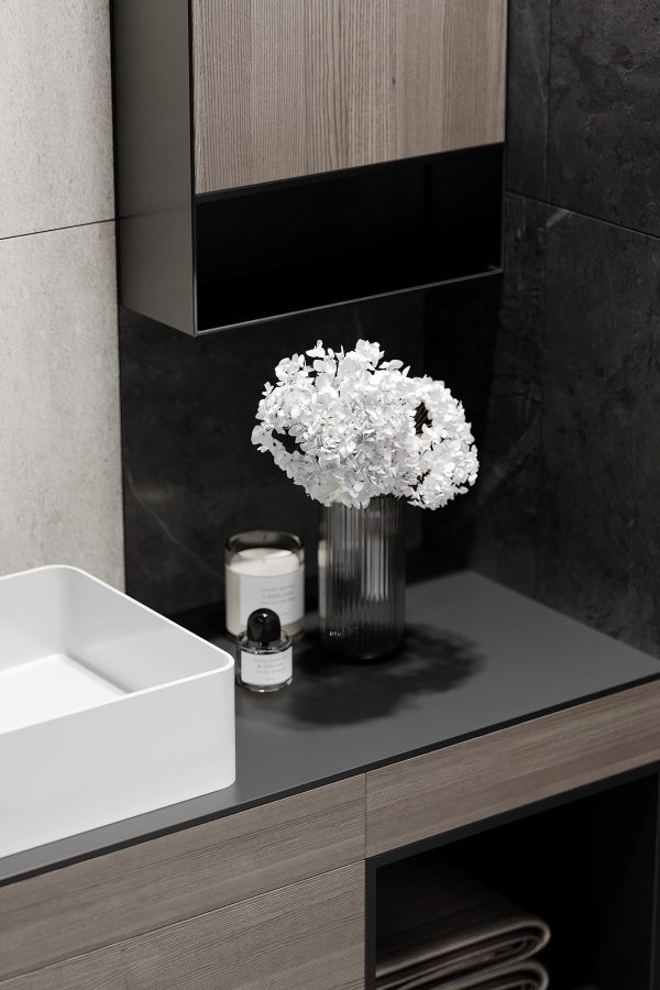
Quality materials reduce the need for extraneous decoration – although a simple glass vase filled with fresh flowers is always a welcome addition to a sophisticated room.
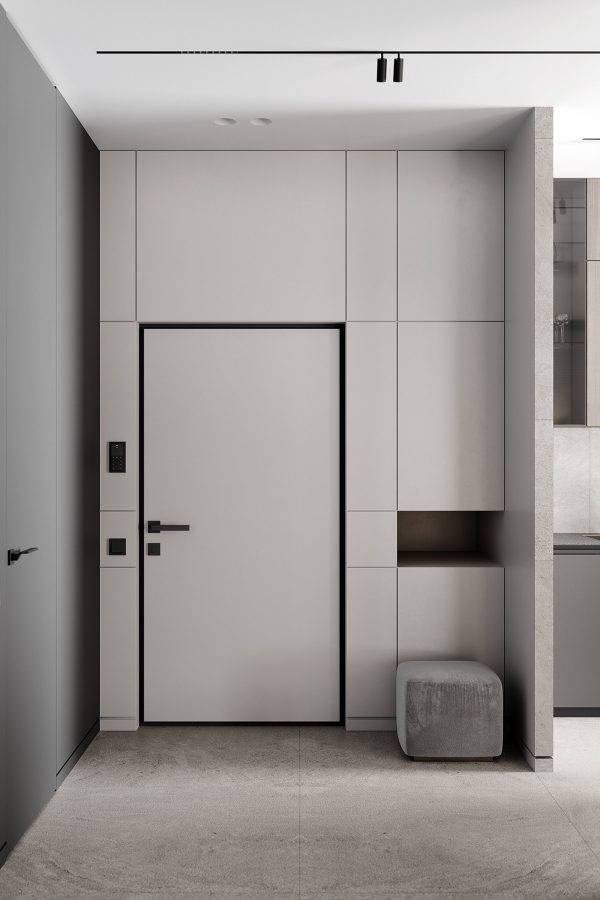
This tour closes with a quick look at the entryway. Built-in cabinets hide away essentials like scarves and gloves while the small pouf offers a place to sit while removing shoes.
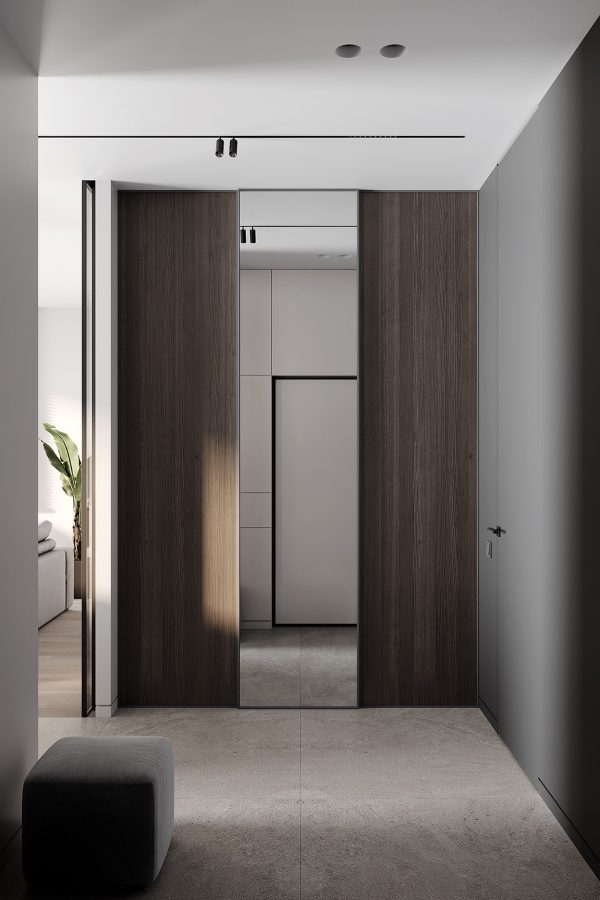
This simple area features a floor-length mirror on the other side, great for quick outfit checks before a night out.
Recommended Reading: Ultimate Studio Design Inspiration: 12 Gorgeous Apartments
Related Posts:
 Stepping Up Studio Apartments
 5 Small Studio Apartments With Beautiful Design
 Studio Apartments In Three Modern Styles
 50 Modern Kitchen Designs That Use Unconventional Geometry
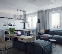 Studio Apartments for Young Couples
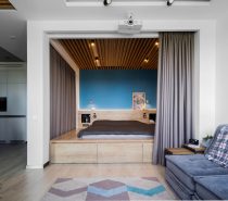 3 Small Apartments That Make The Best Of The Space They Have
Source: https://ift.tt/2ZOo4ZB
No comments:
Post a Comment