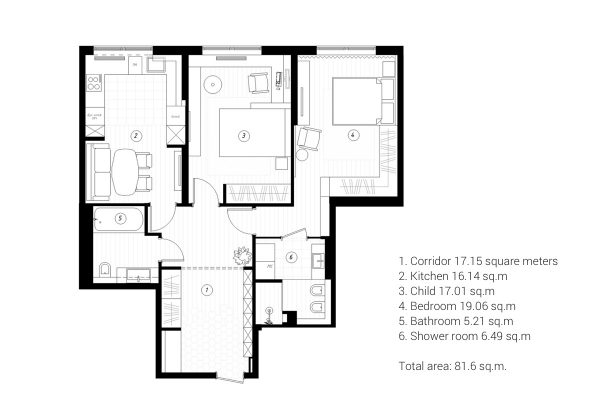
The Prime Life project is an 81.6 square metre apartment design for a young woman and her son, located in Saint-Petersburg, Russian Federation. The brief from the client stipulated that her son’s single bedroom and bathroom should be separate from the rest of the apartment with its own personality, there must be plentiful storage opportunities to tidily house all of their belongings with ease, and that the kitchen should accommodate an extra sleeping spot for an occasional guest. Cartelle Design embarked upon a Scandinavian minimalist style in calm and gentle shades; this has resulted in a muted colour scheme that exudes elegant sophistication.
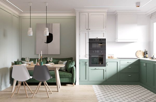
Soft continuation of a light and even colour palette throughout the apartment makes each space flow gently into the next, without any jarring visuals. That said, each room has its very own sense of style.
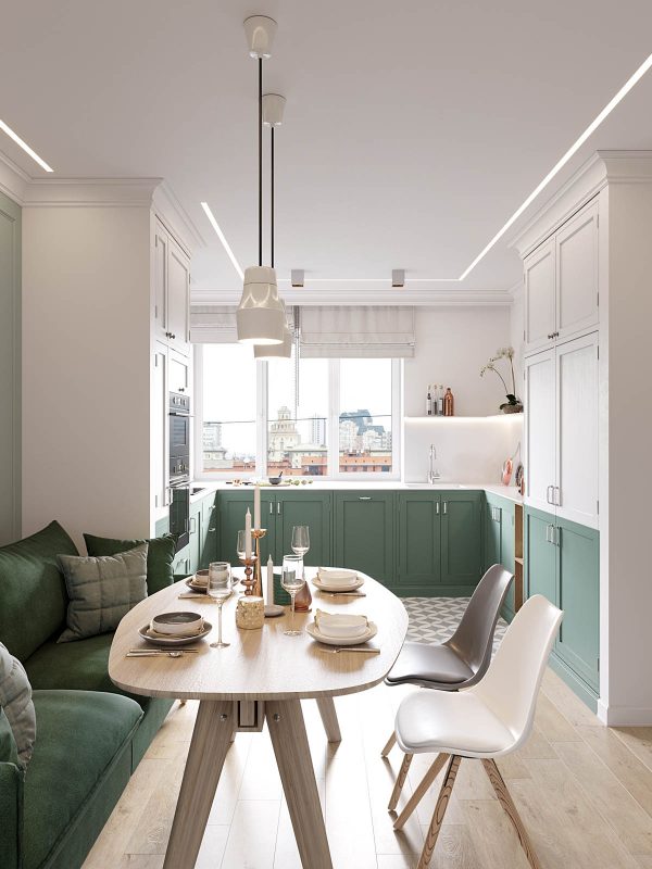
The kitchen diner holds a beautiful dual tone kitchen, where white cabinets populate the upper half of the vertical space above frosty green base units. The cupboard fronts are of a timeless shaker design, finished with white enamel handles. In the dining area, a sofa creates seating at one side of a Scandinavian style dining table, and doubles as a bed for guests. On the other side of the light wood table, two Scandinavian dining chairs complete the suite in contrasting grey and white finishes.
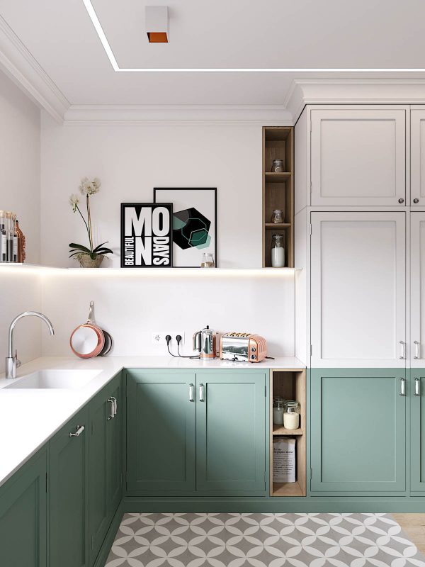
The cool colours of the painted kitchen has been accessorised with warm copper kitchen equipment, keeping the look current and bang on trend. A single L-shaped installation of open kitchen shelving runs above the countertop, displaying quirky artwork, plants and favoured cooking oils. A bright glow emits from the underside of the shelving, casting extra light over the worktop below. Exposed storage cubbies provide other opportunities for having often used ingredients quickly to hand.
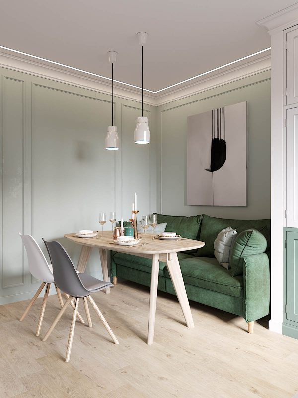
The artwork here is modern and monochrome so as not to interfere with the smooth colour story.
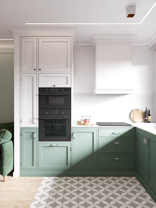
Light wooden flooring in the dining room gives way to patterned tile in the kitchen, for a durable easy clean surface.
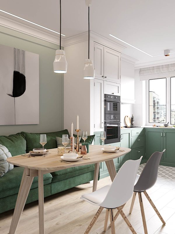
Two simple dining pendant lights hang over the dining area, and a subtle strip of LED lighting around the perimeter adds extra illumination all the way to the edges of the room.
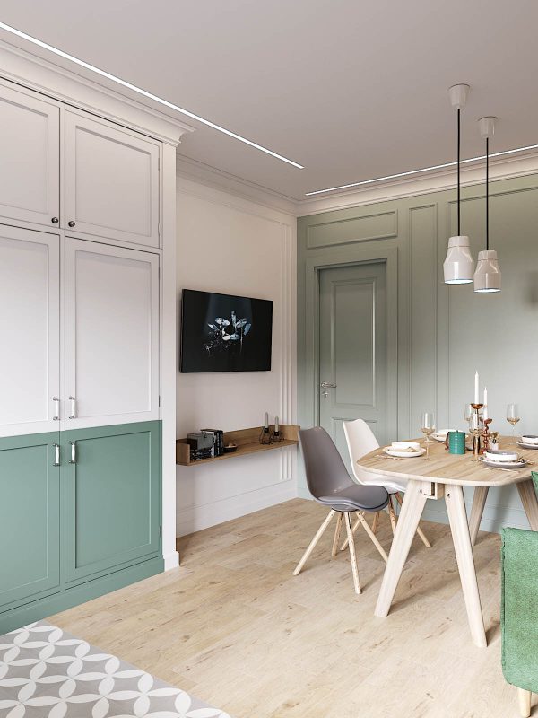
The opposite wall to the kitchen is decorated with green wainscotting to complement the design of the cabinets. Beside the door a flat screen TV occupies a small area, underlined by a small wooden shelf. This gives the dining room sofa a third use – as a lounge – as there is no other living room in this home.
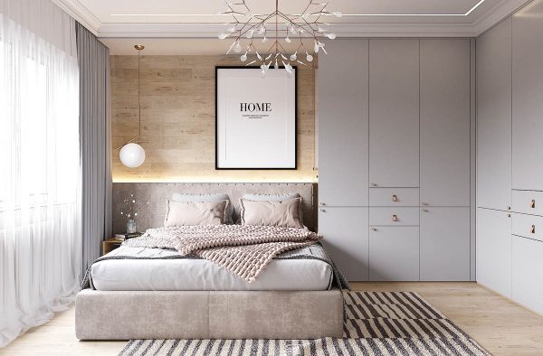
The master suite is a beautiful serene space that is decorated in powder greys. Artwork and a bedside bedroom pendant light bring in crisp white accents. The IC S2 Pendant is suspended over a neat wooden table that matches light wood paneling above an upholstered headboard. The area rug is a strong monochrome design that adds a little weight to the scheme. Notice how the rug sits centrally in the room, inline with the overhead light, despite the beds offset position due to an extensive array of closets. The asymmetrical layout achieves perfect balance.
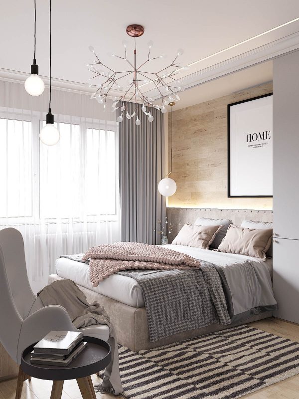
The central light fixture has a decorative spray of white glass and rose gold. A bed throw and cushions are a pretty blush shade which works beautifully with gold tones.
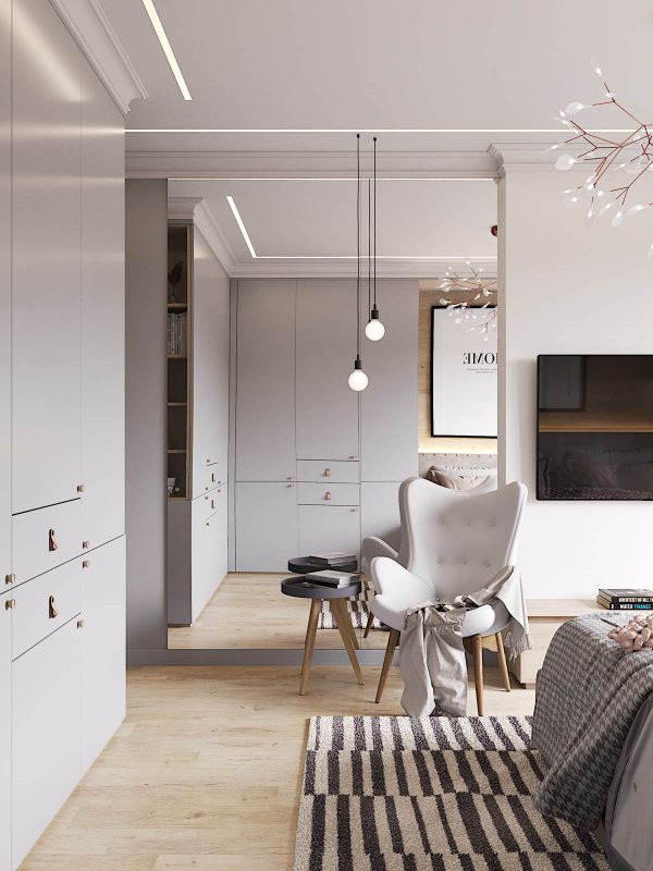
The white accent chair is a button back winged design with curves that invite you to sit.
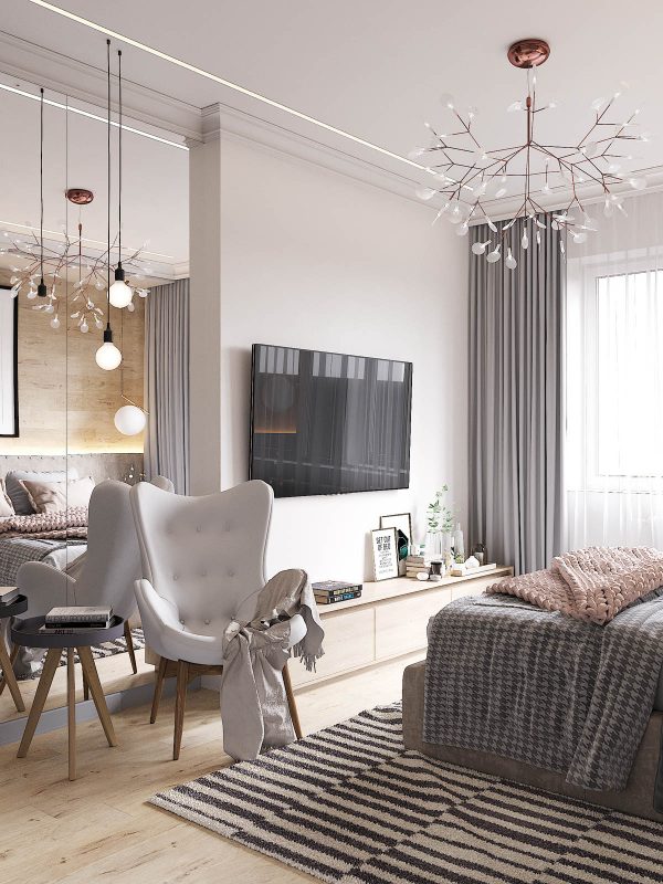
A small tray table holding current books, plus a couple of exposed bulb pendants, makes this a sweet reading chair A console beneath the television holds more reading material as well as a few decorative vases and knick-knacks.
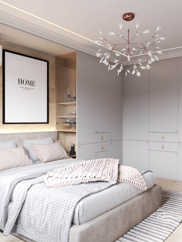
Recessed shelves in the side of the closet forms a second bedside unit, with the upper half protected from dust by a clear glass door.
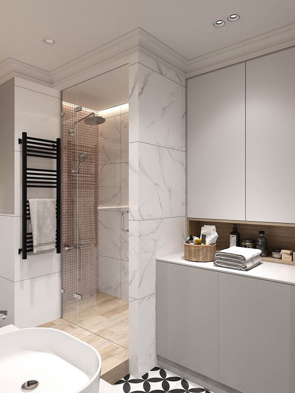
The grey, black, white and blush colour story continues in the master bathroom.
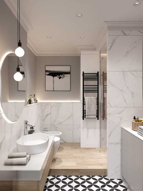
The monochrome art here is also of a similar style to that found in the kitchen diner, as is the pattern of the floor tile.
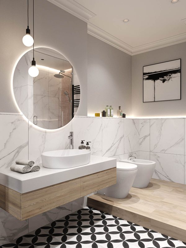
Bathroom facilities are raised up on a wooden step that matches a floating wood vanity unit.
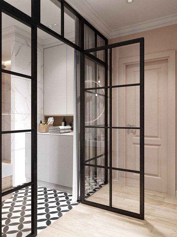
The bathroom is accessed via clear glass doors off the hallway. Privacy is achieved by drawing the curtain.
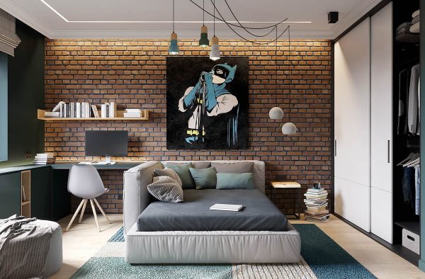
The boy’s bedroom design has a clever layout whereby a study area has been made separate from the sleeping area with the implementation of a cushioned divide around one side of the bed. The segregation between the two room uses promotes both focus and relaxation.
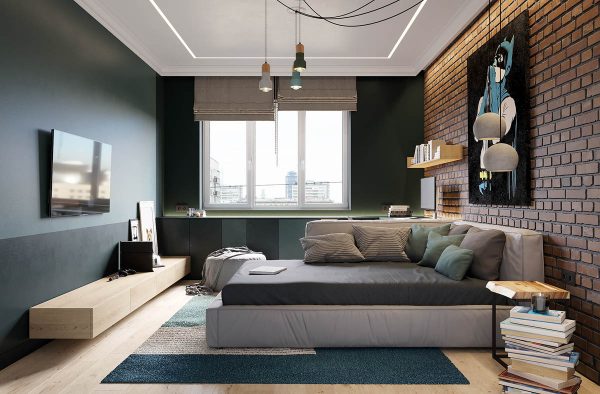
Superhero artwork on an exposed brick feature wall gives the scheme an youthful city vibe.
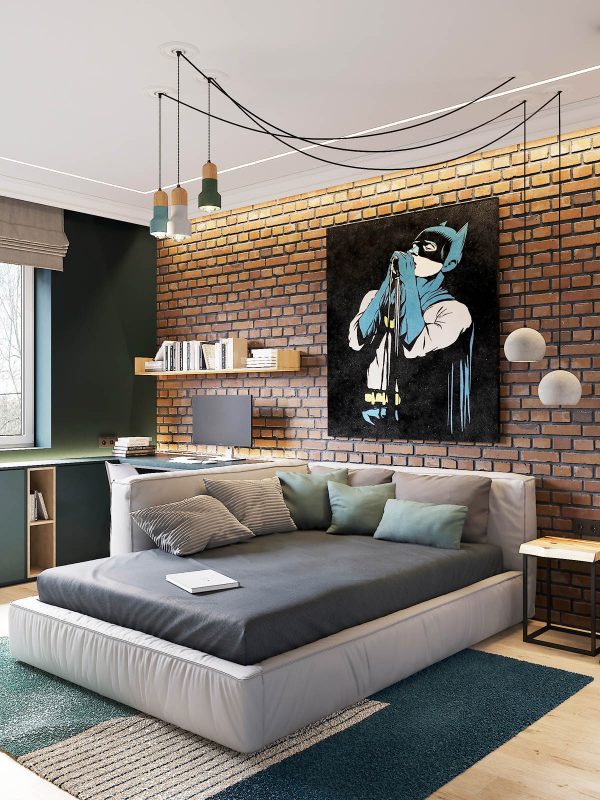
Exposed wiring adds in a touch of industrial styling too. These wood and concrete pendants are available here.
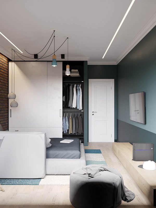
The colour scheme launches into teal in this room, giving it a different mood from the rest of the home.
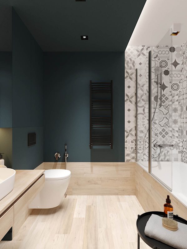
The bathroom that is allocated for the use of the young man of the house also carries a deep teal hue.
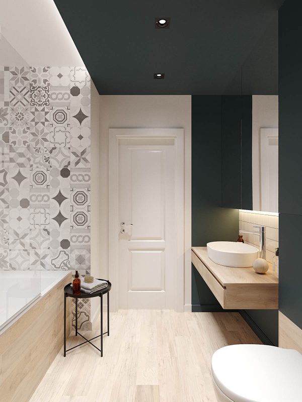
Light wooden elements marry up with those also used over the hall in the master bathroom.
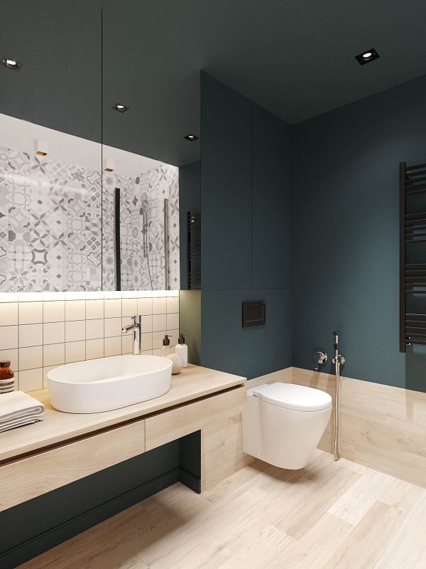
Large mirrored cabinets hide away bathroom clutter.
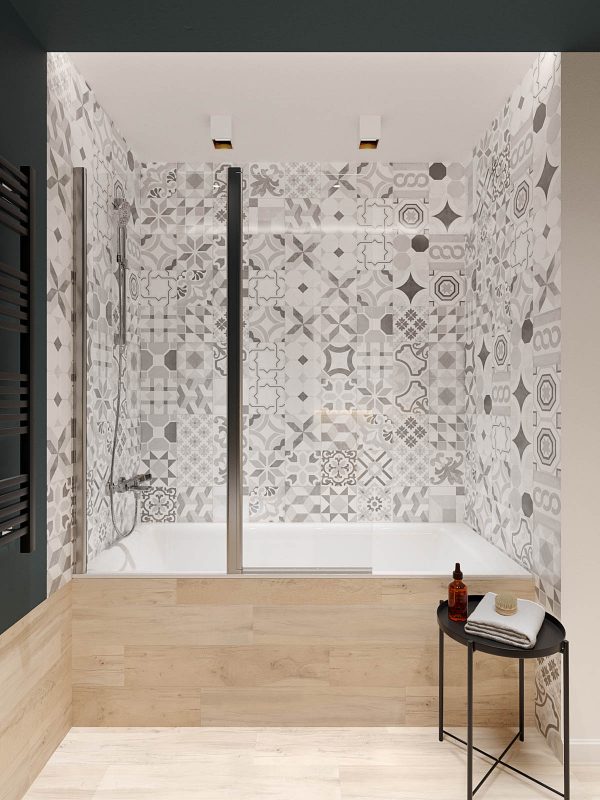
Tiling around the wet zone carries a multitude of contemporary pattern.
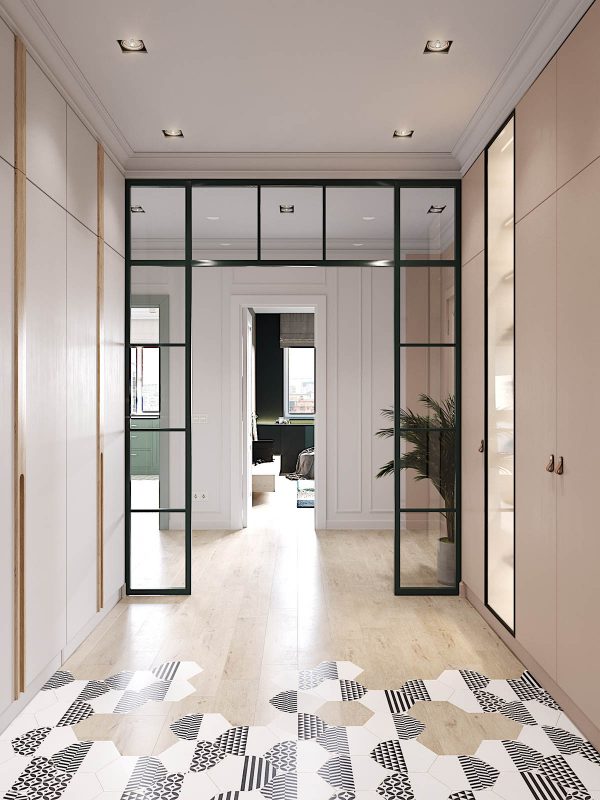
The home entryway is flanked on either side by huge storage cupboards. A recessed display unit is lit from within, behind a clear glass door.
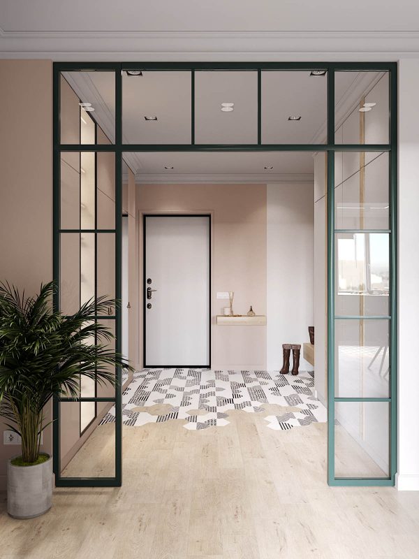
A glazed archway with a green frame marks the end of the foyer and the beginning of the homes inner quarters.
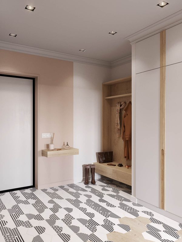
The flooring in the entryway has a stunning monochrome geometric overlay in a honeycomb design, which breaks to reveal a wooden floor.
Recommended Reading: 50 Inspirational Scandinavian Style Bedrooms
For more regular updates from Home Designing, join us on Facebook.

If you are reading this through e-mail, please consider forwarding this mail to a few of your friends who are into interior design. Come on, you know who they are!
Related Posts:
 Chilled Out Modern Home in Muted Colour
 Small Modern Apartment Design With Asian And Scandinavian Influences
 20 Light, White Bedrooms for Rest and Relaxation
 Two Large Scandinavian Style Homes For Young Families
 A Scandinavian Style Apartment That Exudes Chic Comfort
 Chic Scandinavian Studio With Lofted Bed
Source: http://ift.tt/2FY0now
No comments:
Post a Comment