In lack of an ocean view, designer Indot concentrated on the interior of his apartment – not to create a dazzling decor as such, but to make a space that was intricately tailored to how he used his place. Time would be spent on the sofa or entertaining around a dining table, and relaxation after work looked like a long soak in the bathtub. So with a limited floor area of just 46 square metres (498 square feet), the apartment was thought best suited to an open plan layout. In this home, every single room can be opened up to be part of one whole space… even the bathroom.
Photographer: Hey!Cheese
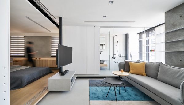
Because property prices run high in Taipei, homes are small and every centimetre has to be utilised to its fullest effect; this central rotating TV makes viewing possible in the living room, bedroom and even from the bathtub.
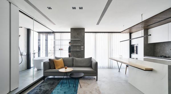
Although all areas of this home are able to merge as one, if more than one person is present then privacy can be achieved by manipulating sliding doors and screening devices.
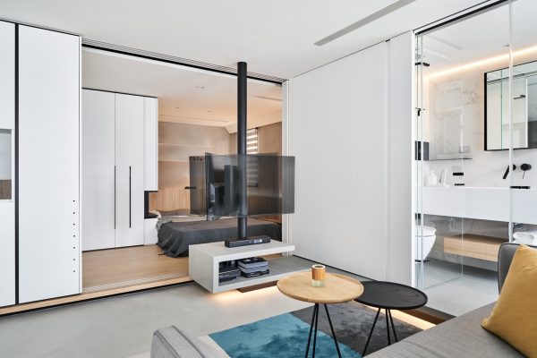
The TV unit is formed using a folding concept, which at its open side runs into the platform floor of the bathroom.
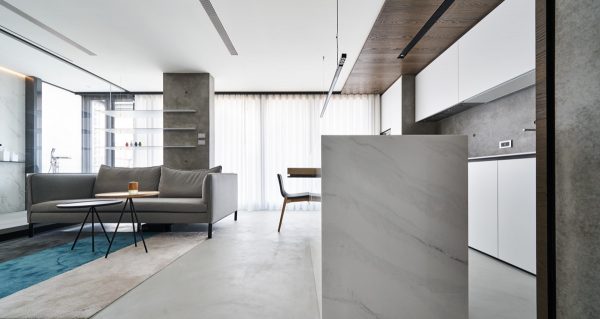
The decor is simple. Predominantly white paintwork with grey feature walls are brightened by just a splash of colour found in soft furnishings and small accessories.
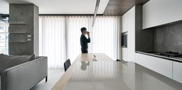
The dining table is a bespoke design that has been blended with the kitchen.
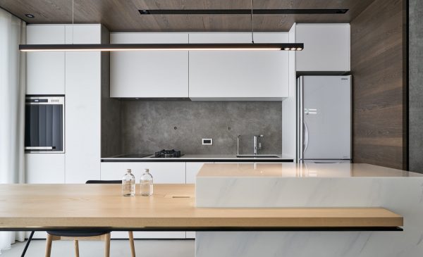
The table is a good sized space that can be utilised as an extra place for working or entertaining.
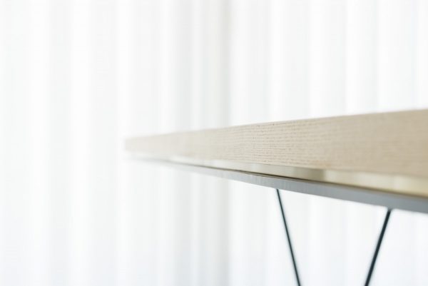
Just two iron pipes support the large tabletop. Beneath the wooden layer there is also a copper coated titanium base, which adds elegance to the line.
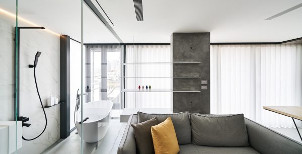
Opening the bathroom up to the living room makes the living space feel larger. The raised floor of the bathroom makes the facilities appear like a display.
Above the sofa, a set of suspended shelves appear to float lightly in front of the windows.
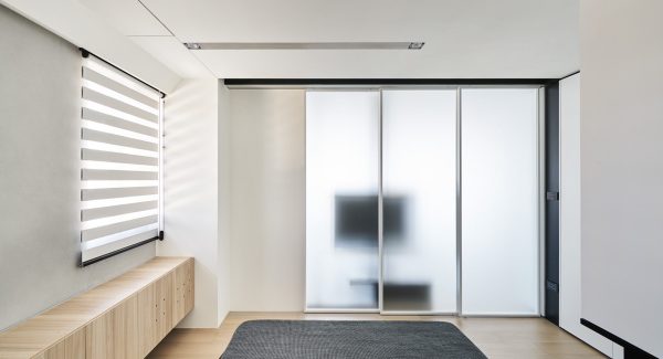
Frosted glass in iron frames form large sliding doors between the lounge and bedroom. A black slice running up and over the ceiling makes the visual divide more solid. The matte glass allows light to filter through to the bedroom from the windows in the living room.
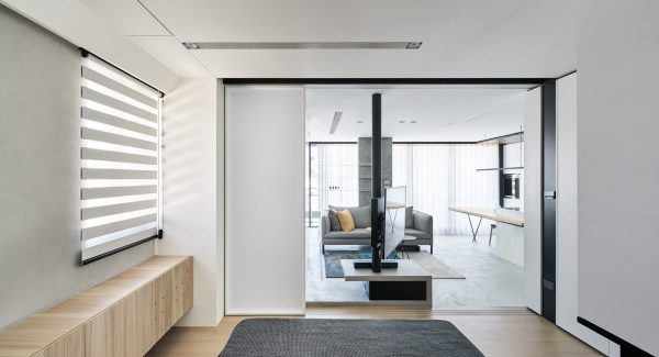
If more privacy is desired in future, the remaining ceiling space provides opportunity to install curtains across the bedroom doors.
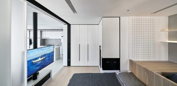
The decor in the bedroom was designed to feel warm and comfortable. The flooring was made different from the living room in order to define the separate areas, as well as being a little cosier underfoot in the sleep space.
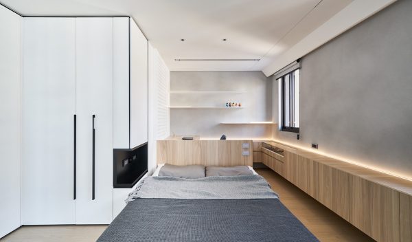
An intertwining effect was created with the bedroom and study cabinetry. A volume that runs the length of the window wall continues in a return that ends under the desk. The surfaces of the cabinets have been kept deliberately vacant to allow strip lighting to achieve the desired floating effect, and to highlight the wall texture. Power cable trunking was built into the desk to prevent the inevitable tangle of cables from becoming part of the fixture, and thus ruining the clean look. The minimalist aesthetic allows a small space to feel spacious.
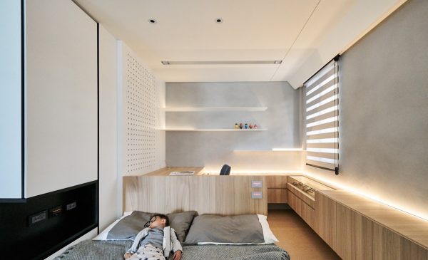
The homeowner has a particular interest in collecting handmade spectacles, so a display case was specially designed to hold this curation, with a tray that slides out to give easy access. On the opposite side of the bedroom, white closets are matched by white wall cladding to create cohesion. A centre shelf has been cut out of one vertical section to provide a bedside unit. Bookshelves have been mounted into the far wall in a clean cut finish.
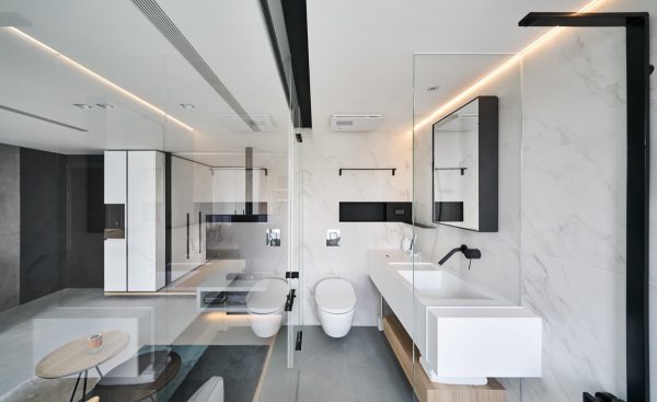
Large panels were used to cover the wall and floor of the bathroom to reduce the necessity for intricate cleaning in the grooves. A thicker wall had to be created to mount a wall-hung toilet. Because of the increased wall thickness, a recessed shelf could be introduced to store toiletries. The vanity unit was custom made to order and covered in artificial stone for a smooth seamless finish over the edge of the basin onto the countertop. Because it is a customised vanity unit, the end nearest the toilet has been installed with a recessed toilet tissue holder. A floating drawer beneath the vanity unit provides a space for fresh towels or washcloths. The vanity extends through the shower screen to create a handy spot for perching bottles.
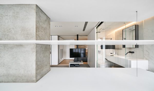
Bathroom accessories were selected in a black finish to create contrast with the white walls. Out in the living room, a desk height platform runs behind the sofa as a third option for a workplace.
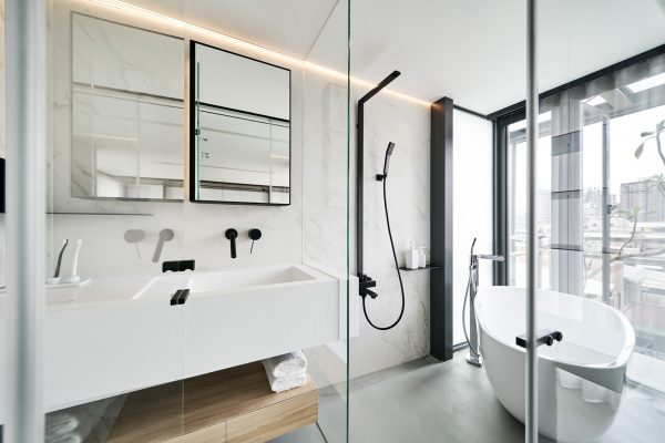
Due to the restriction of space, the shower could not be contained within a cubicle with a door, so a half screen became the compromise. The screen shields the vanity unit from the shower water.
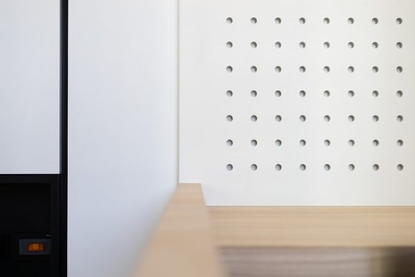
The desk area behind the headboard of the bed has a pegboard feature for making impromptu displays or hanging useful items.
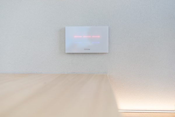
A smart home lighting solution is at play here, by the REXLite company in Taiwan.
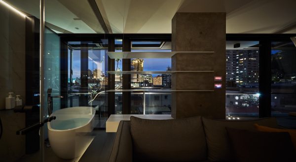
The apartment takes on a different personality by night.
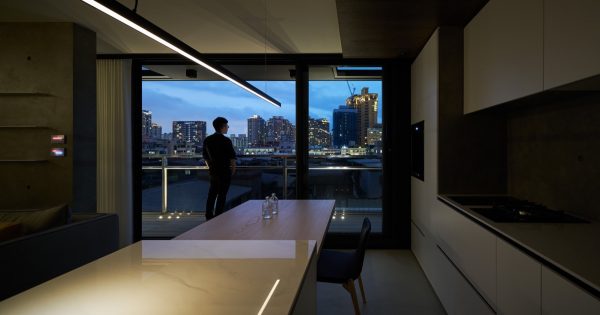
Glass doors retract to connect the indoor and outdoor areas.
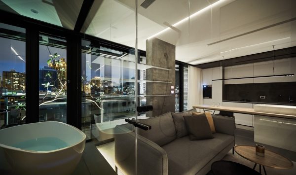
A large terrace is situated behind the sofa.
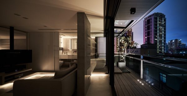
To create a blur between inside and out, the bathroom platform has been extended to the outdoor space.
Recommended Reading: Small Apartment Uses Movable Shelving to Create Endless Design Combinations
Related Posts:
 Small & Stylish: Four Homes Under 50 Square Meters
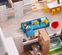 2 Gorgeous Single Story Homes With 80 Square Meter Floor Space (Includes Layout/Floor Plans)
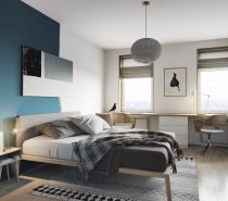 3 Scandi-Style Home Interiors Under 70 Square Metres (750 Square Feet)
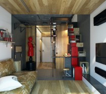 Micro Home Design: A Super Tiny Apartment With Just 18 Square Meter Area (Under 200 Square Feet)
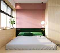 Super Compact Spaces: A Minimalist Studio Apartment Under 23 Square Meters
 Design Inspiration For Small Apartments (Less Than 600 square feet)
Source: http://ift.tt/2G7KV9l
No comments:
Post a Comment